Sock Header Card Design
Fashion Brand
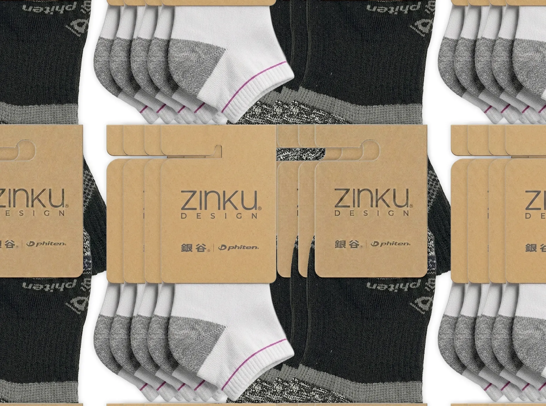
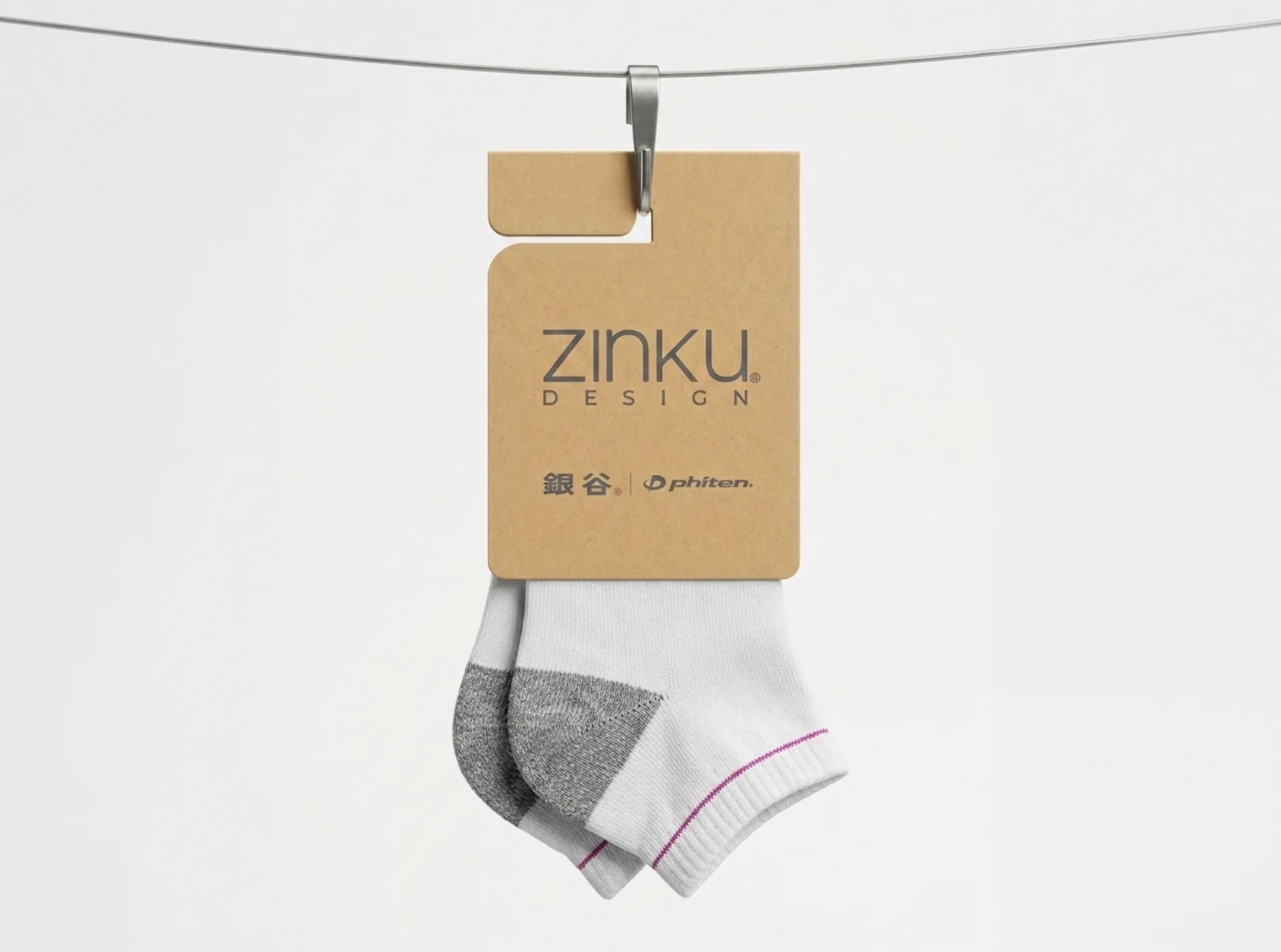
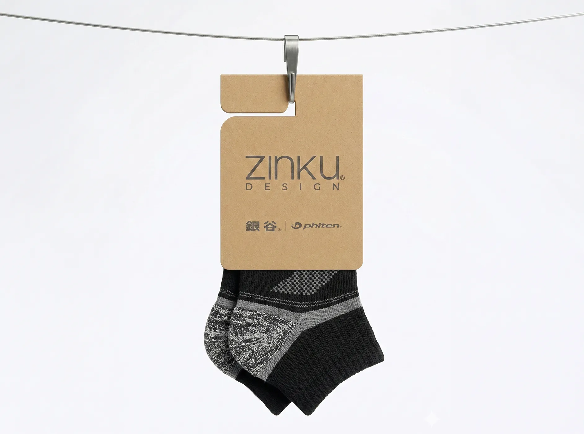
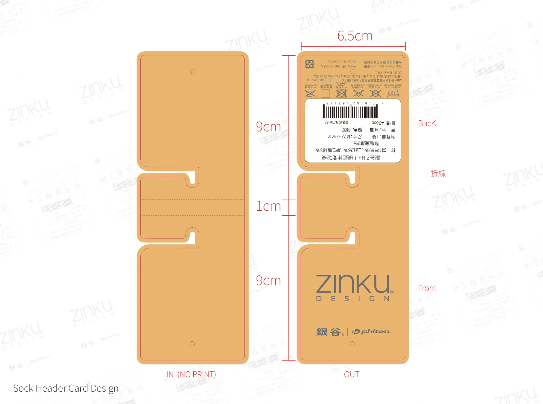
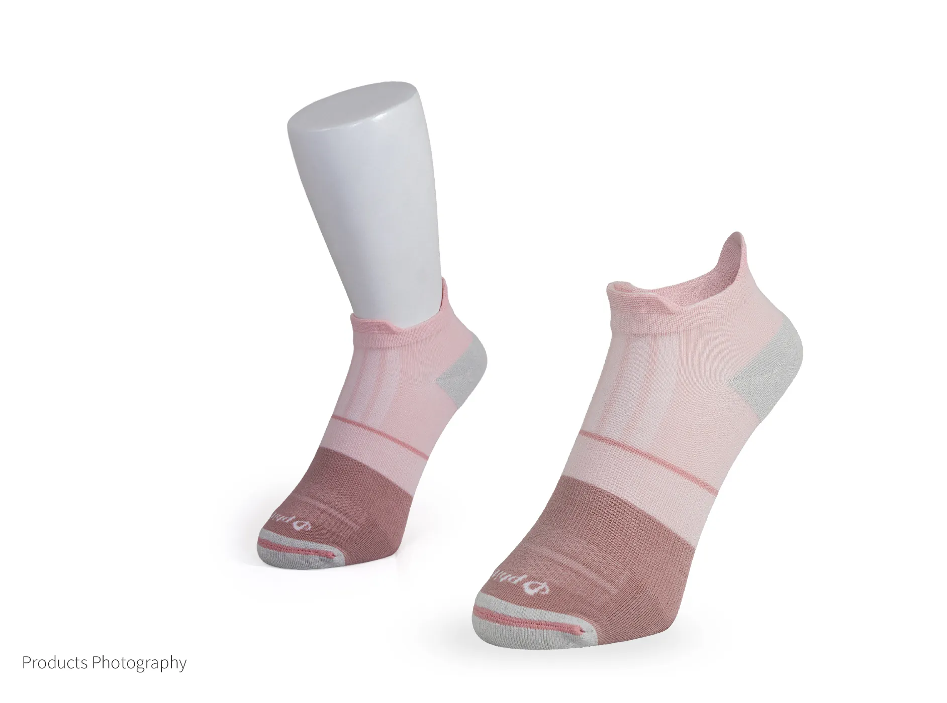
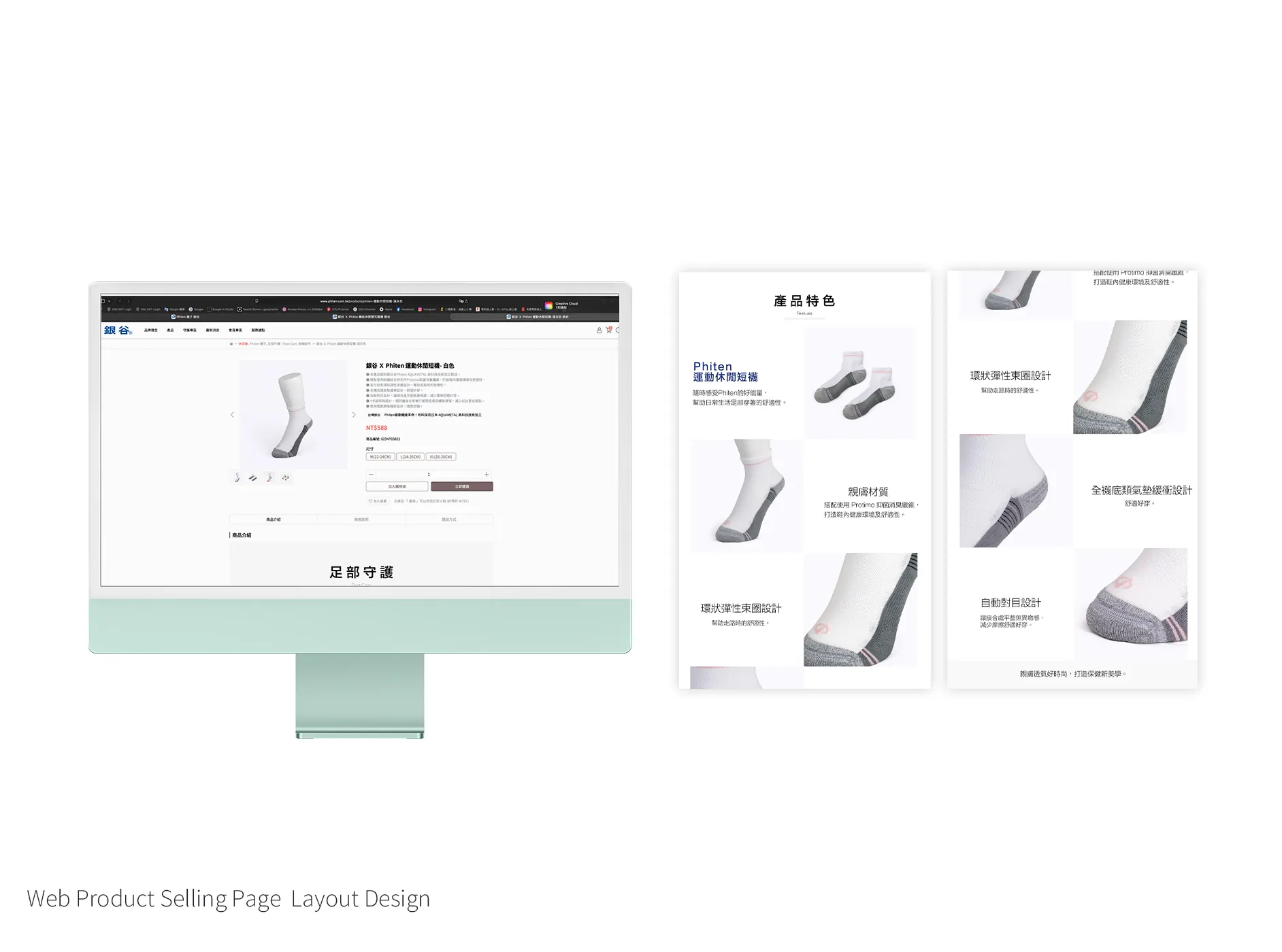
Sustainable Sophistication– This design utilizes recycled kraft cardstock to convey premium quality while eliminating plastic polybags. A strategic blank space on the reverse allows for modular label stickers, improving long-term efficiency and reducing waste. Our complete creative execution—from packaging to professional photography and web layout—ensures a cohesive, eco-conscious, and premium brand experience.
T-shirt Design
Fashion Brand - Very demour Very mindful
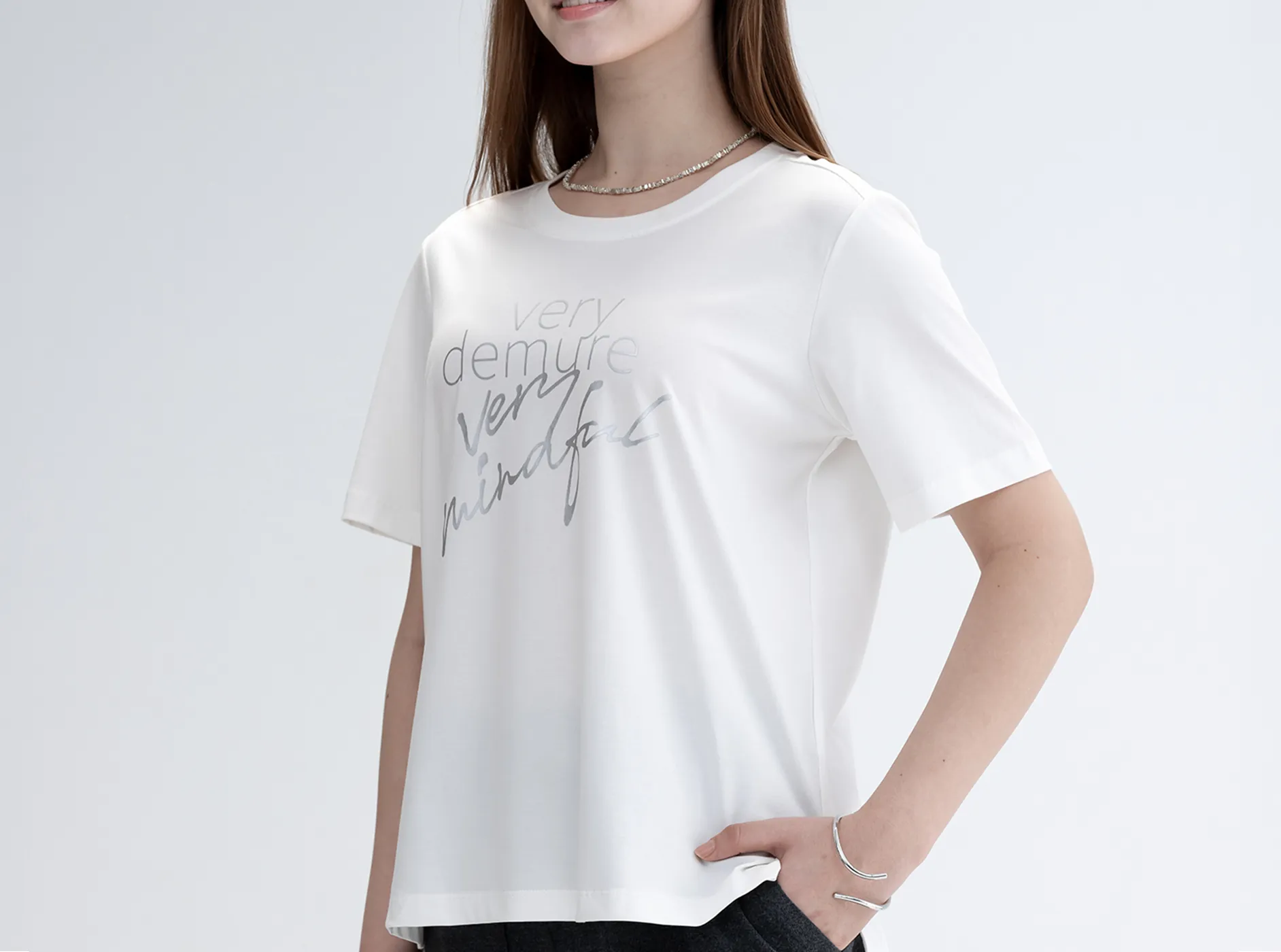
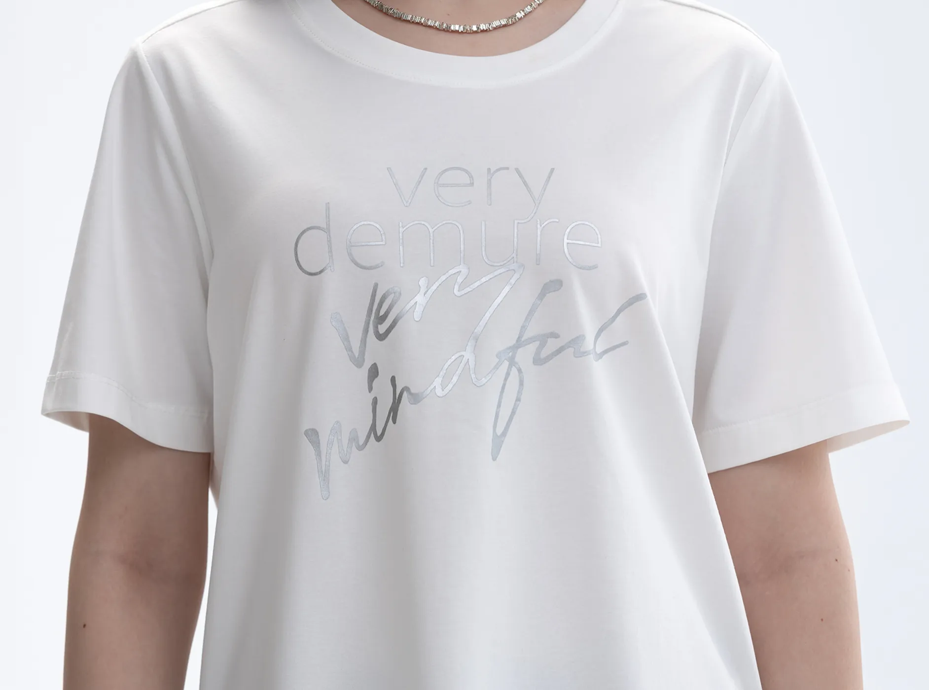

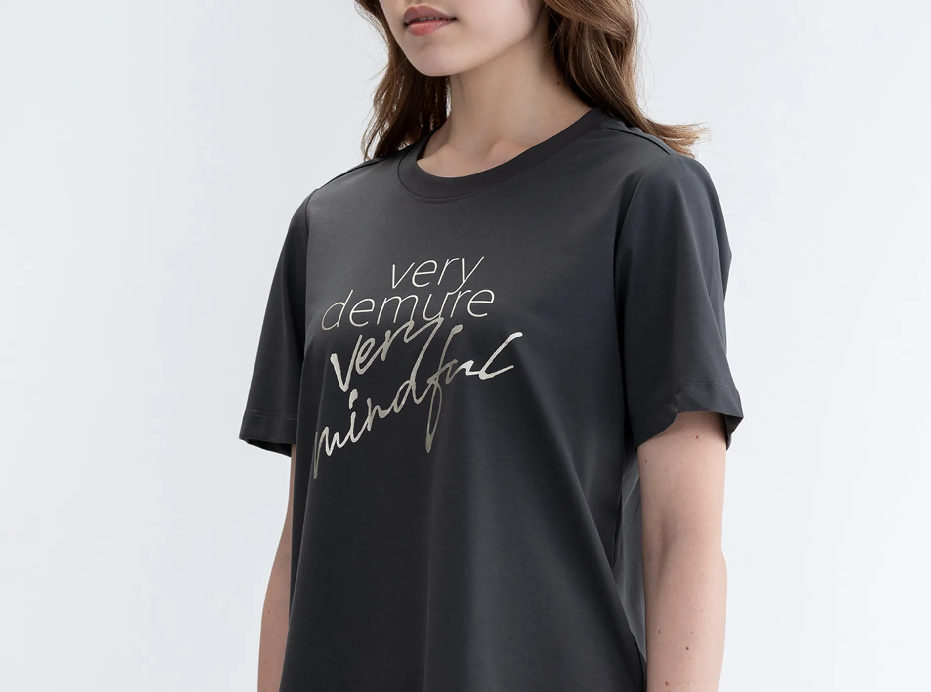
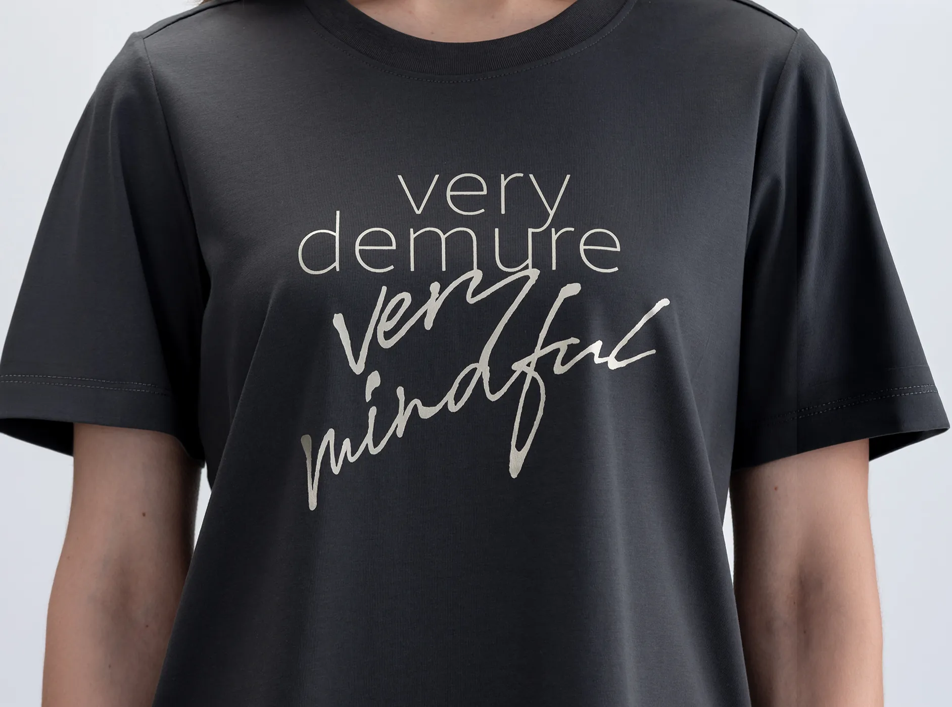

The Art of Mindful Layering - Where precision meets freedom. We paired architectural hairline fonts with expressive script to redefine "Very Demure, Very Mindful." It’s more than a design—it’s a delicate expression of your inner world.
T-shirt Design
Fashion Brand - Sparkle
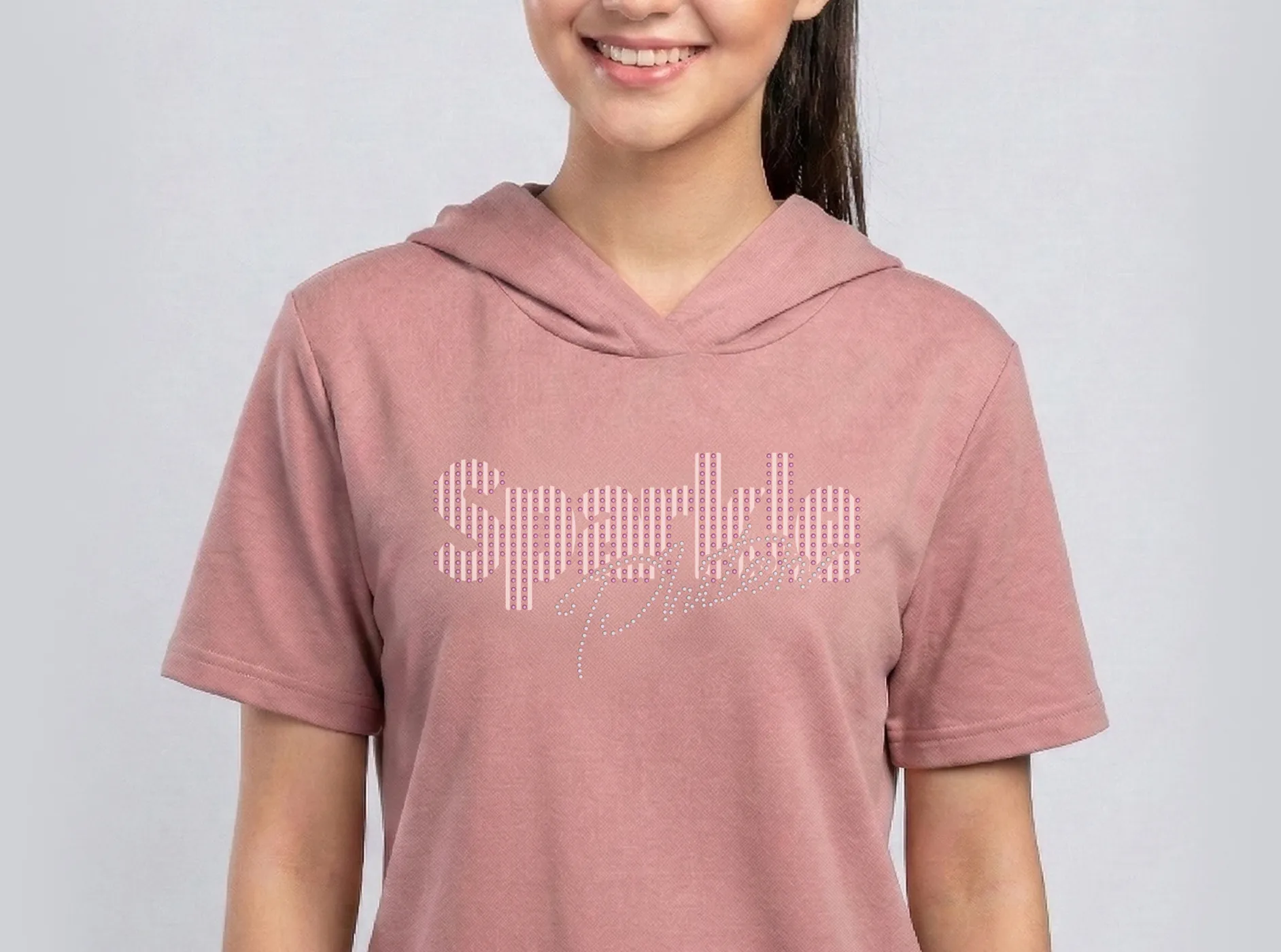
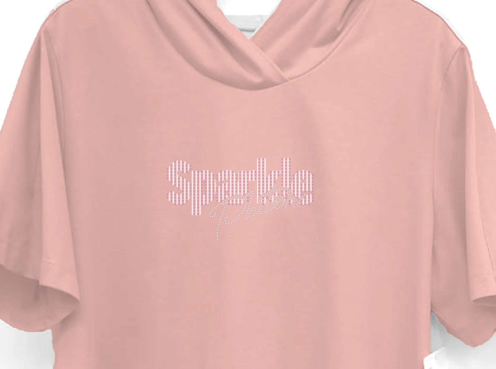
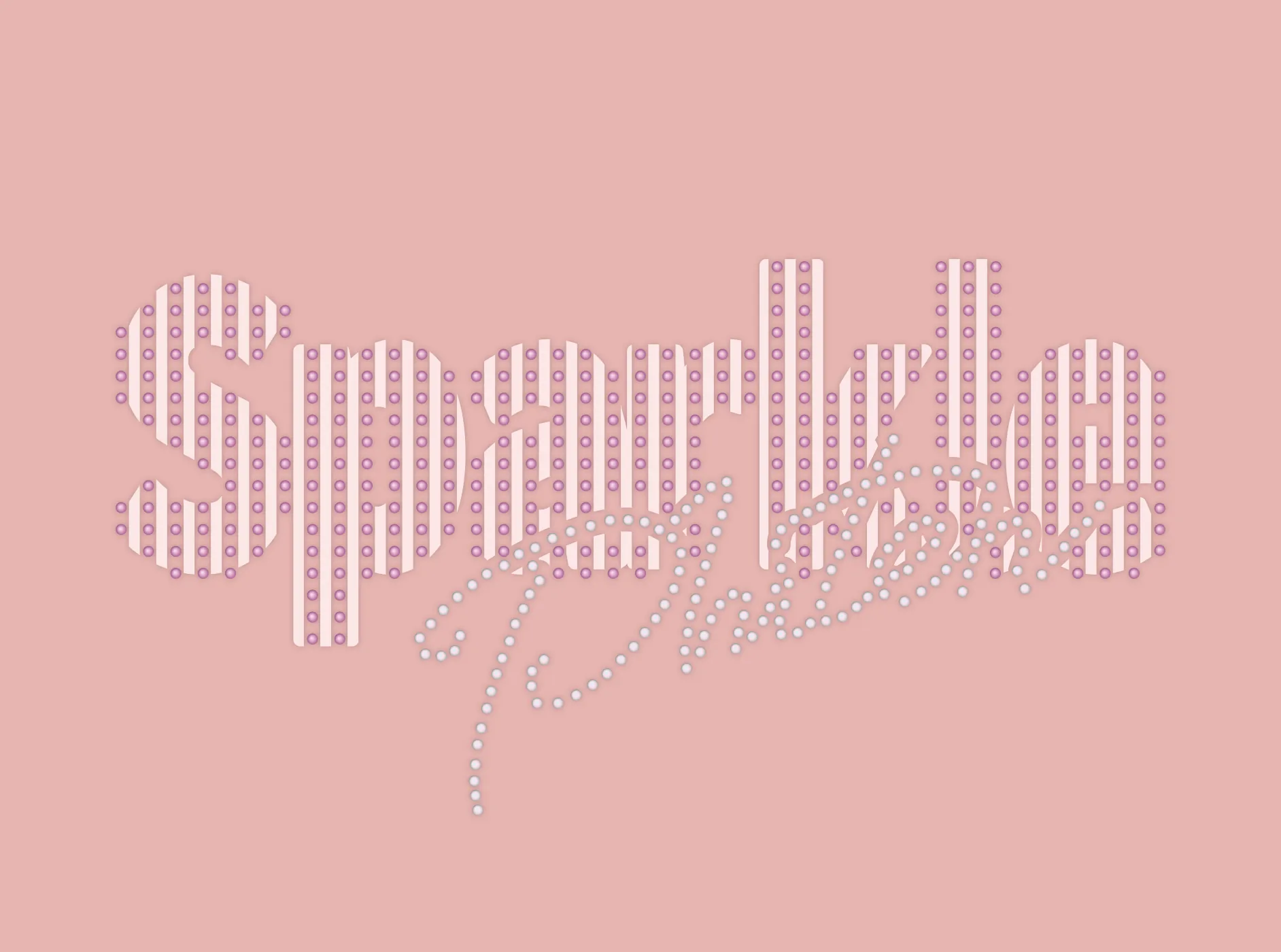
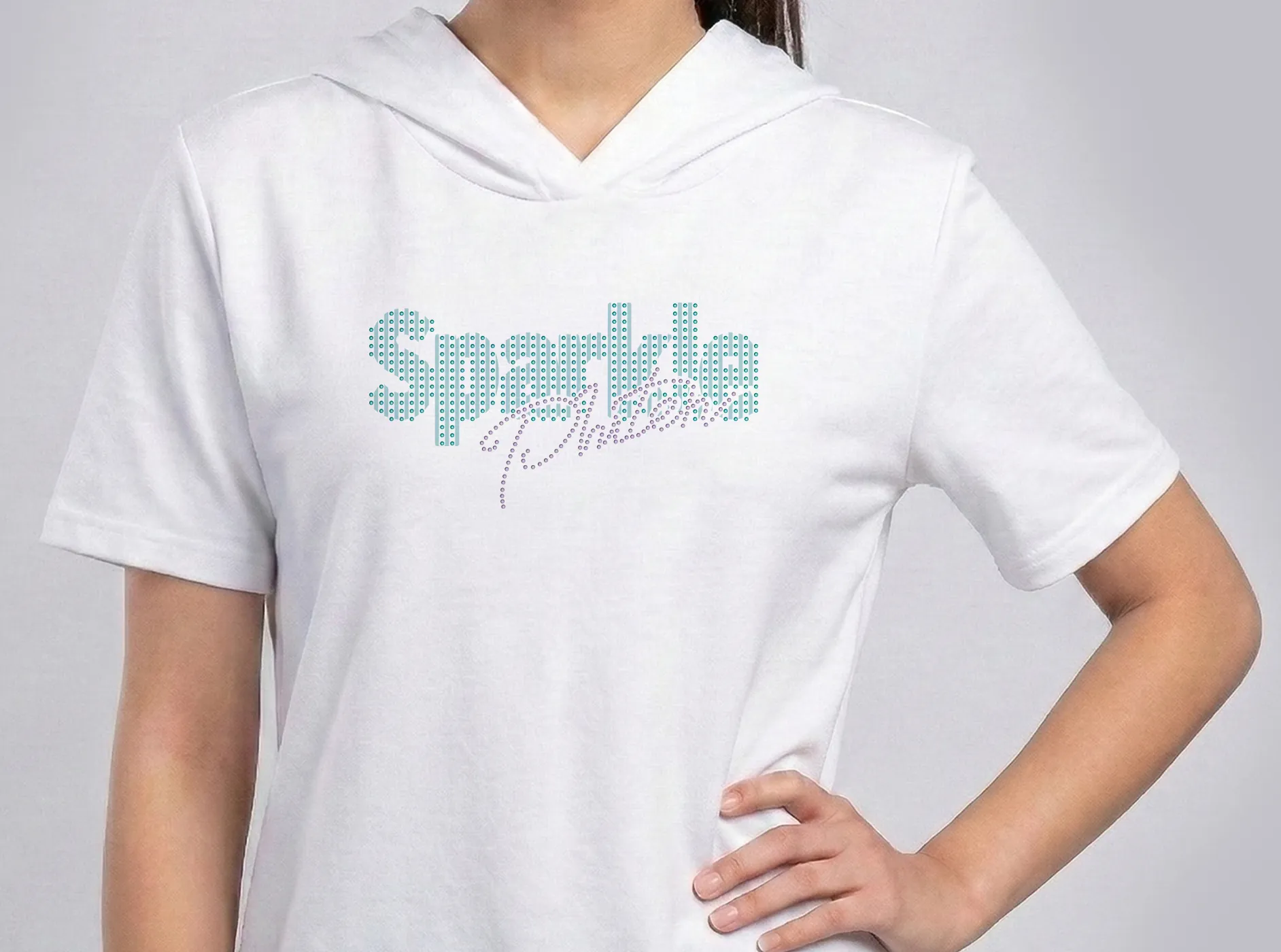
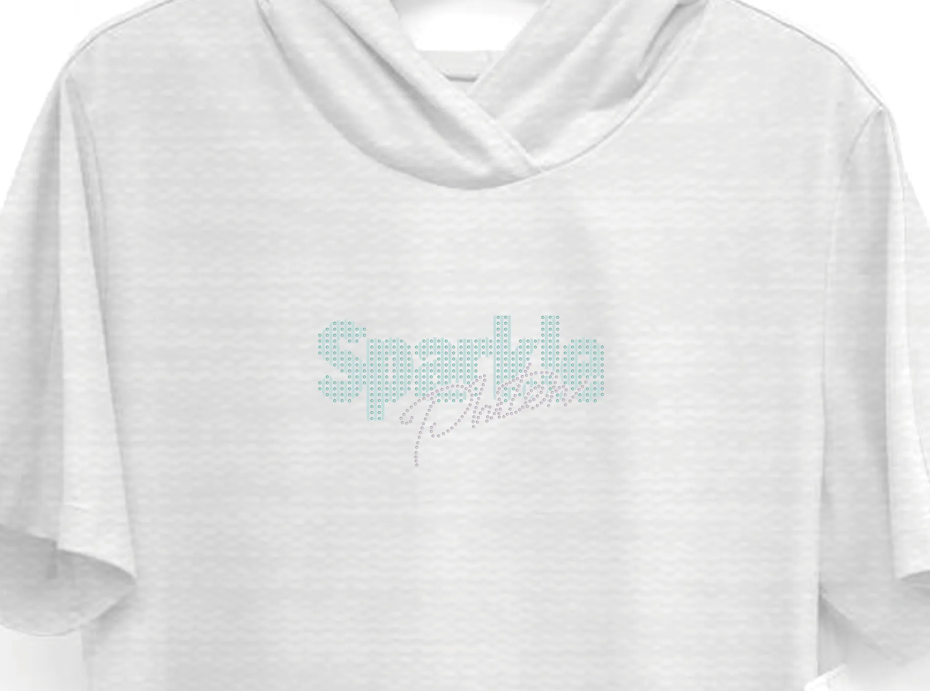

The Art of Radiance: Sparkle Brand Name.Where meticulous multi-stage engineering meets artisanal elegance. By fusing technical screen printing with the brilliance of crystals, we bring the essence of "sparkle" to life in its most luxurious form.
T-shirt Design
Fashion Brand - Be You Own Trendsetter
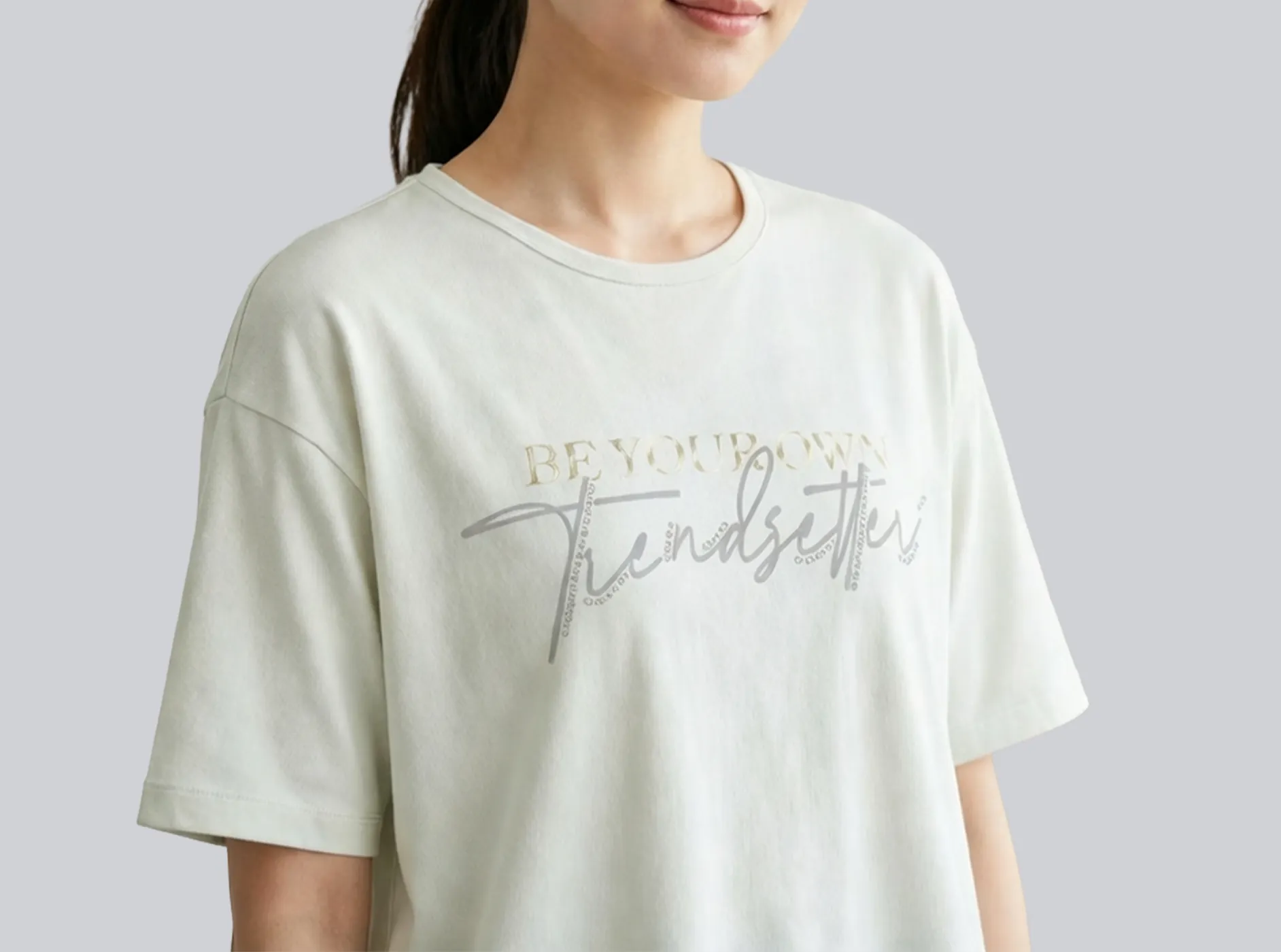
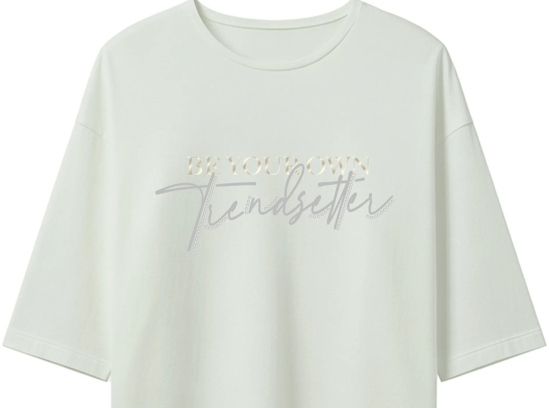
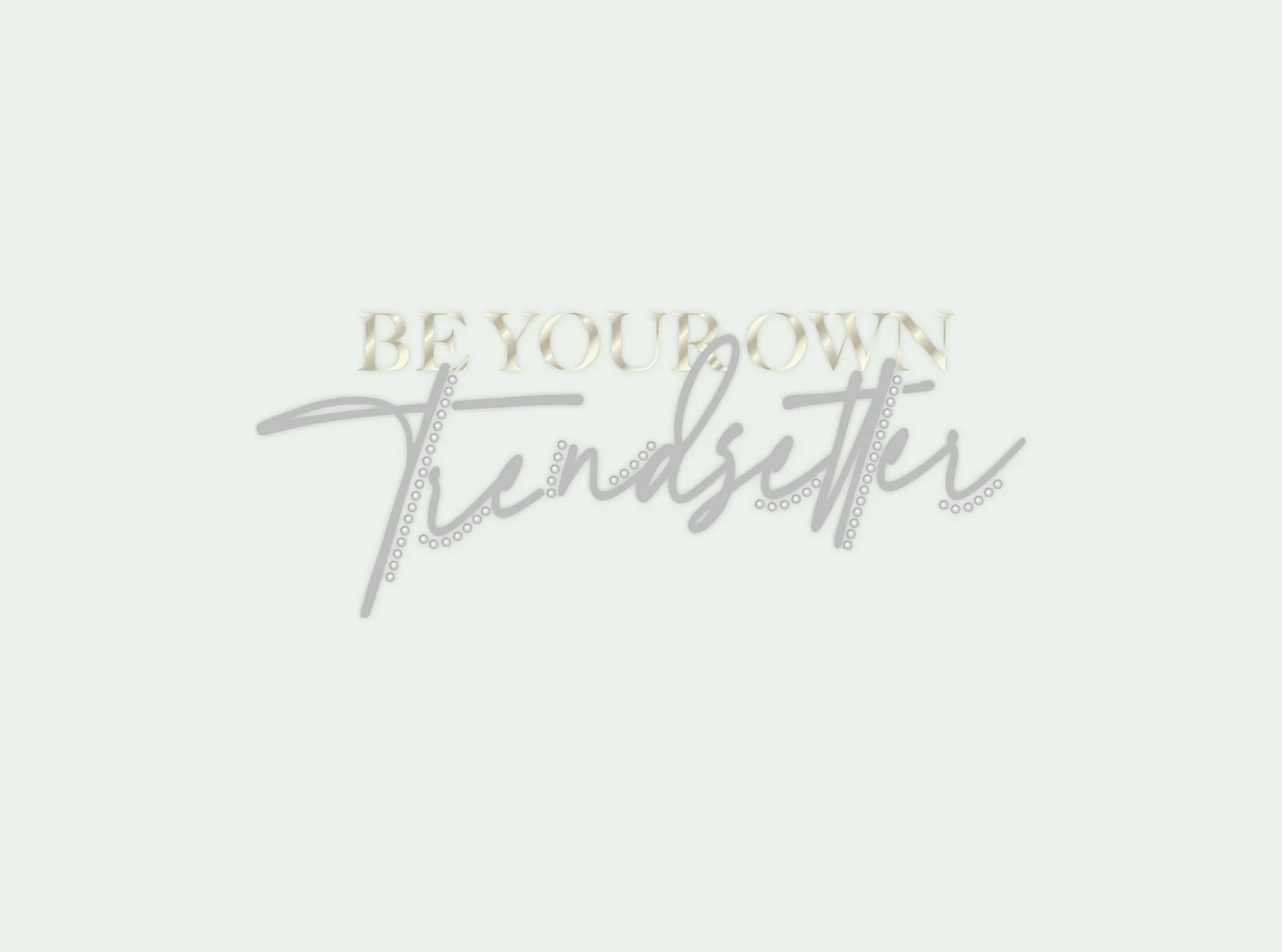
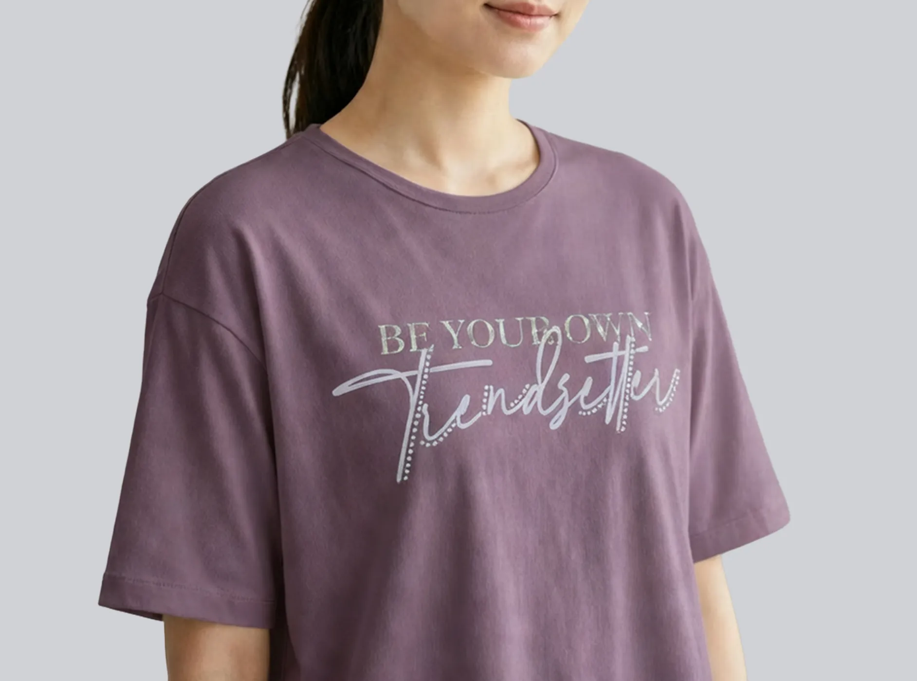
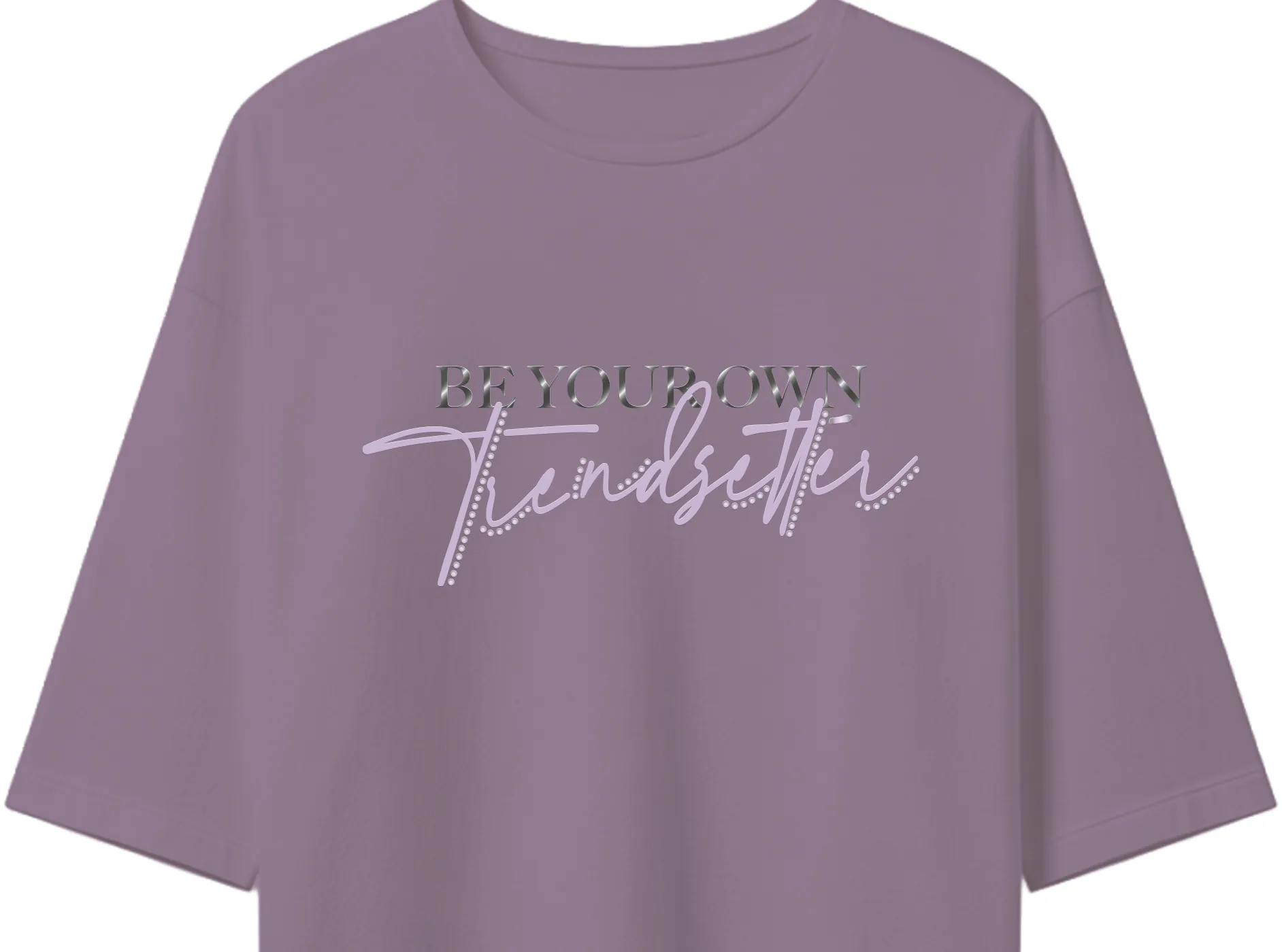

Be Your Own Trendsetter - We combined traditional gold stamping with hand-drawn crystals to show the power of freedom. This contrast creates a high-end look that stands out. It’s not just fashion; it’s the confidence of a leader.
Cosmetics Packaging Design
Stanlen - Taiwan Sugar Corporation
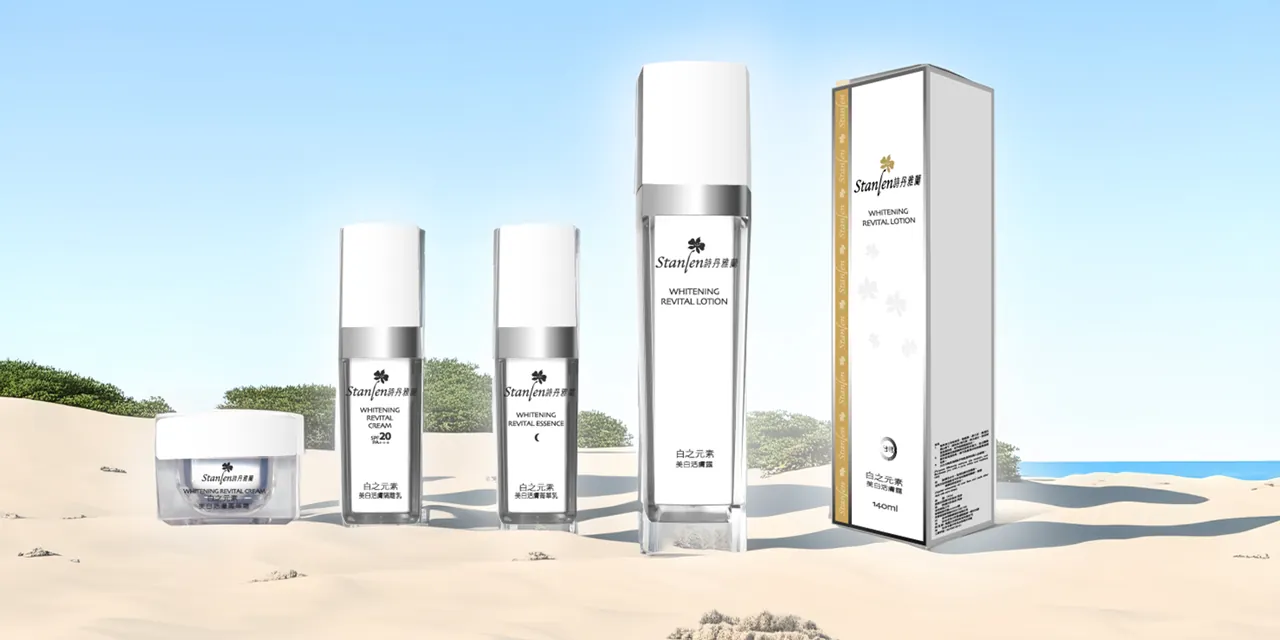
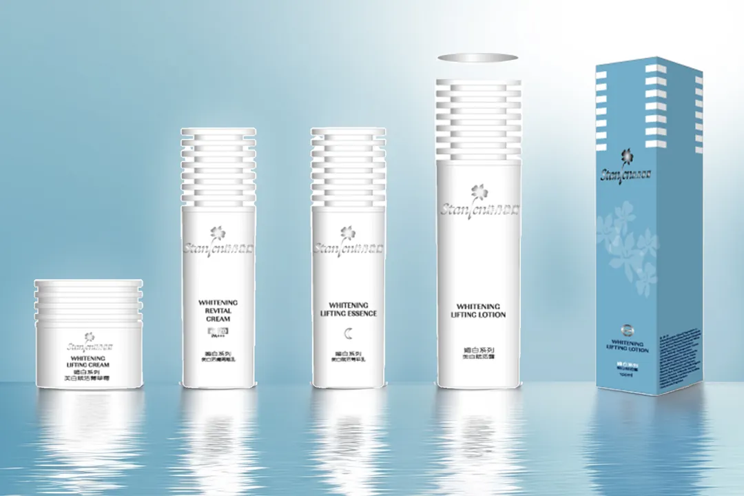
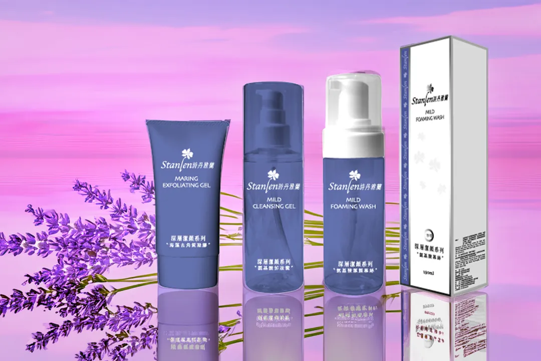
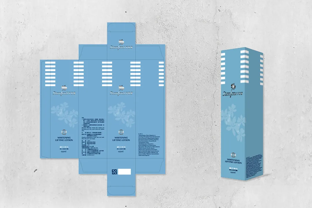
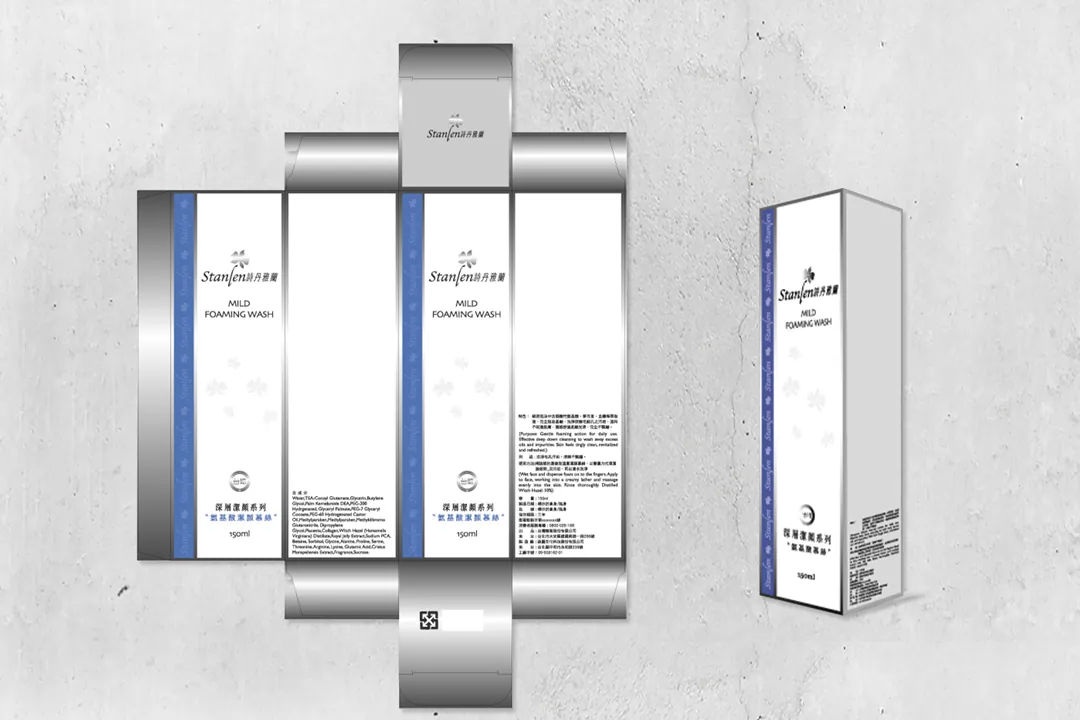
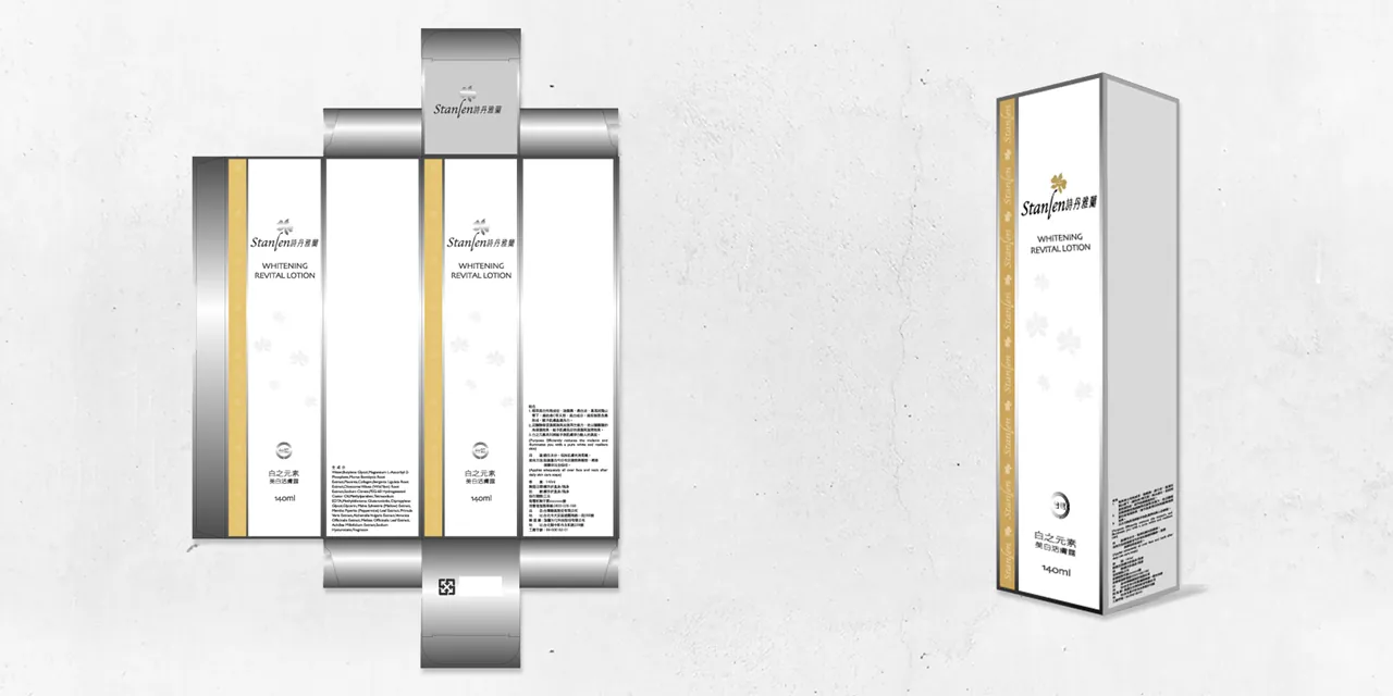
Stanlan, a proprietary brand from Taiwan Sugar Corporation, has created packaging designs targeting three distinct market segments: students, young professionals, and the mature wellness community. Each segment is differentiated by unique bottle designs, using different colors to help consumers clearly distinguish and make their purchase decisions.
Billboard Visual Design
Franz INC.
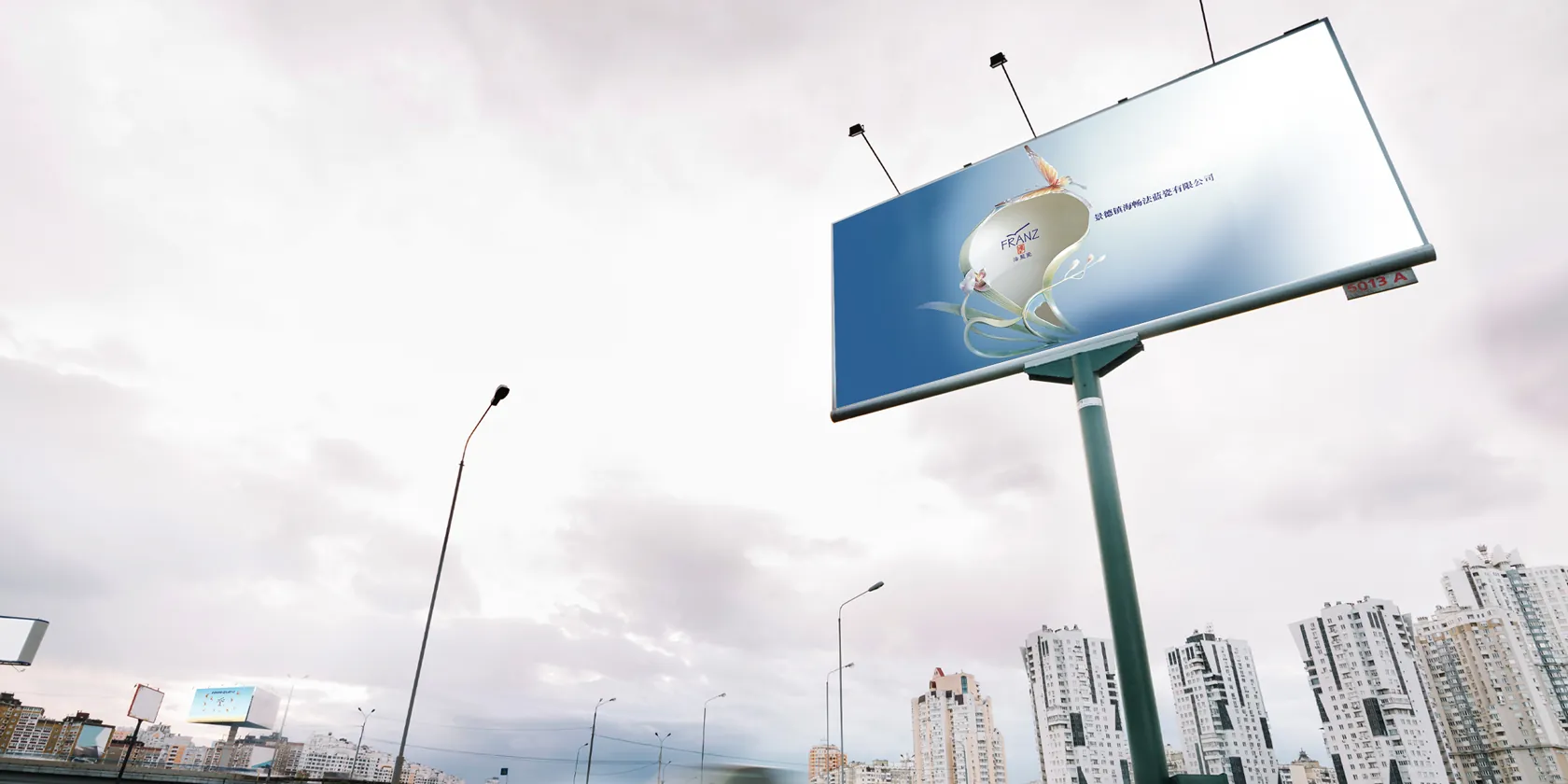
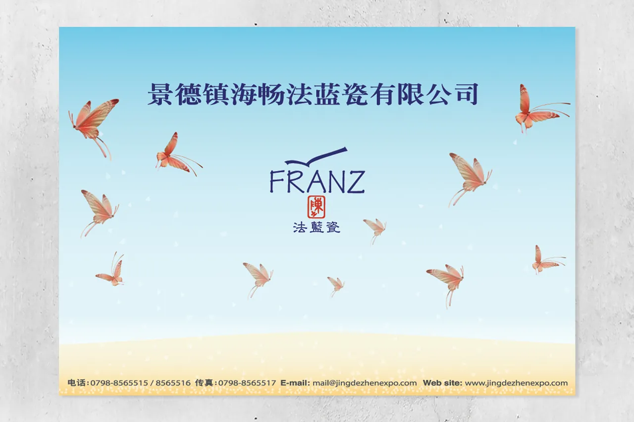
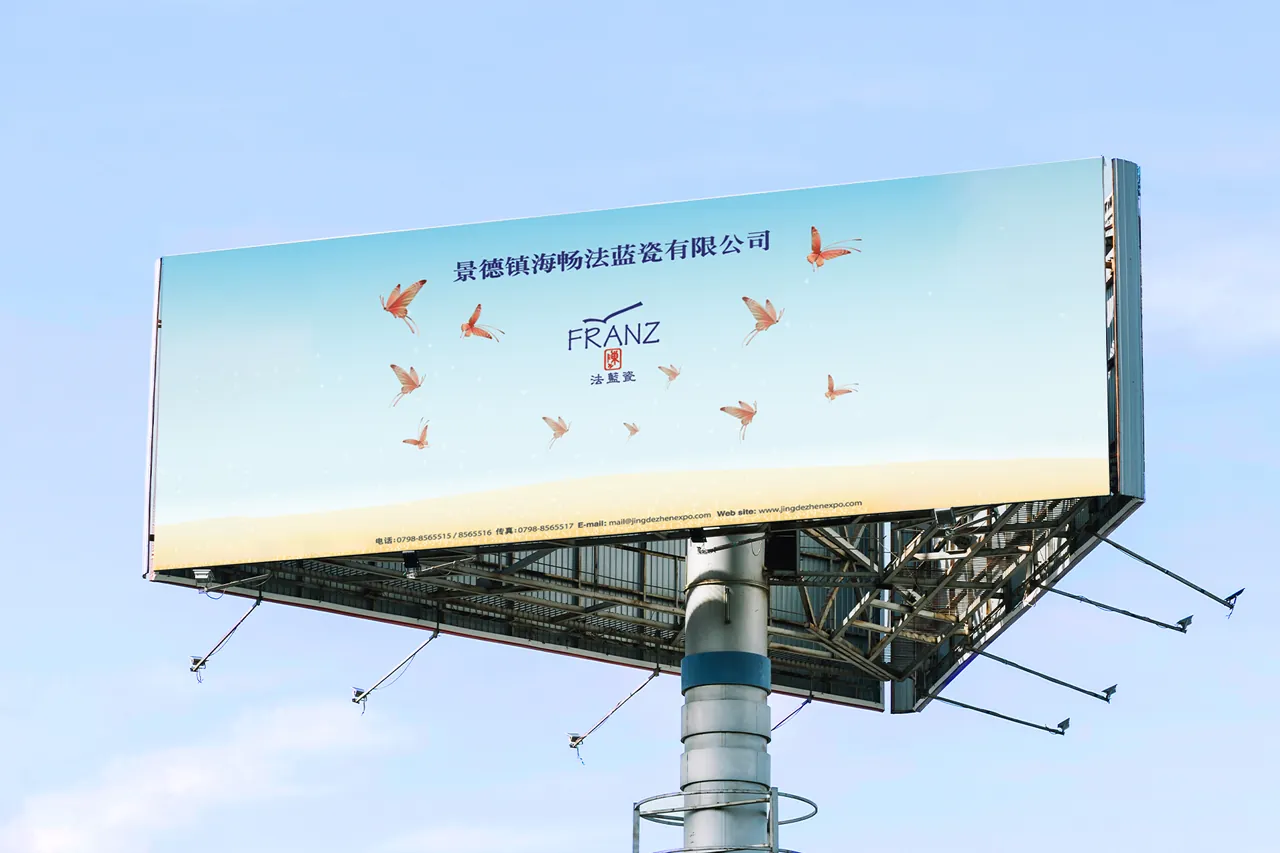
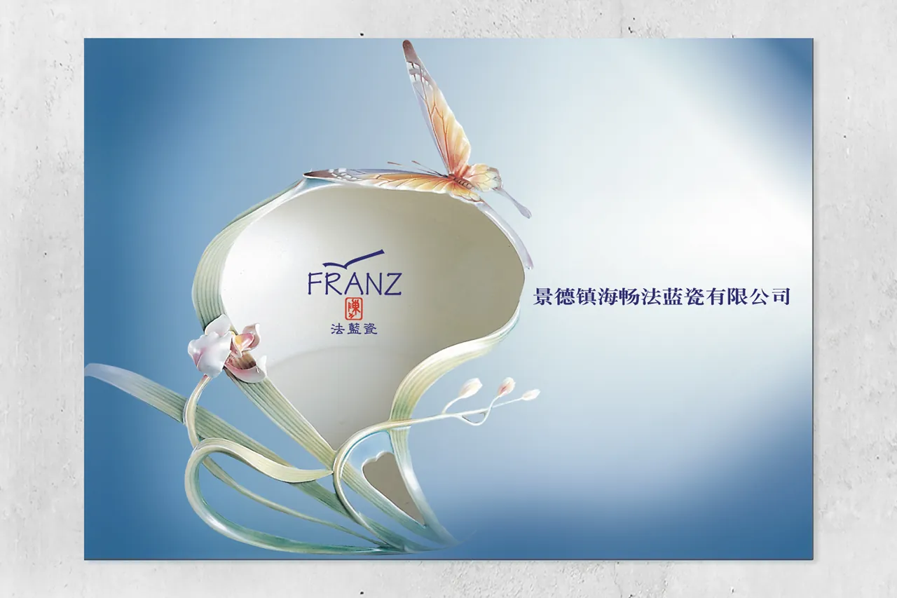
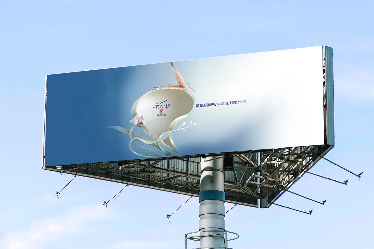
Design the 2004 annual billboard for the Franz Porcelain Base located in Jingdezhen, China. Use iconic pieces as the main visual to ensure that people can instantly recognize and feel the brand identity.
Opening Welcome Reception
2007 National Palace Museum
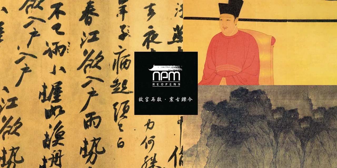
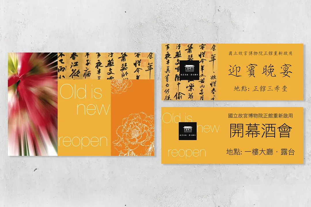
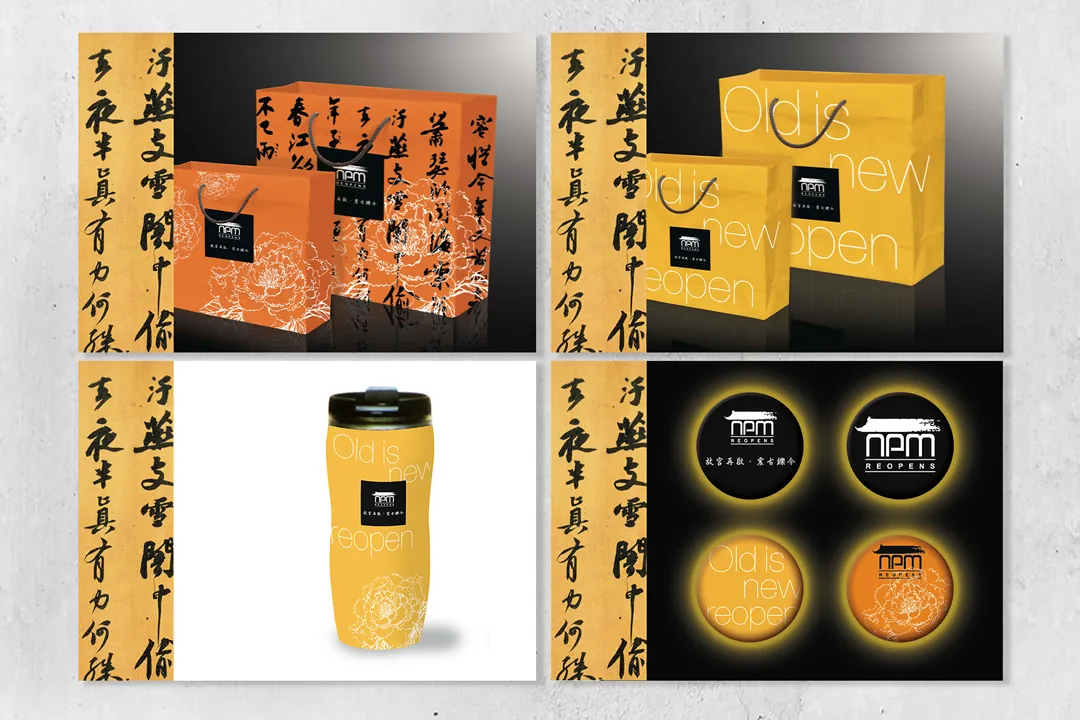
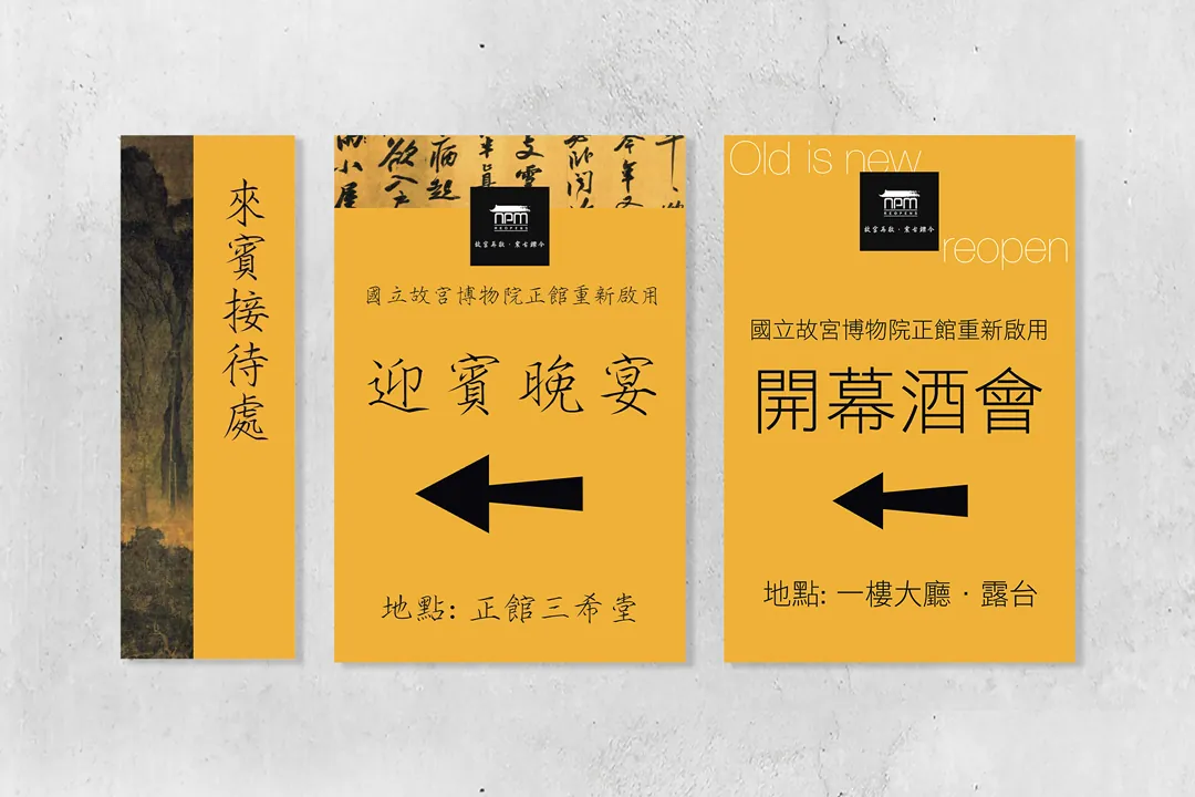
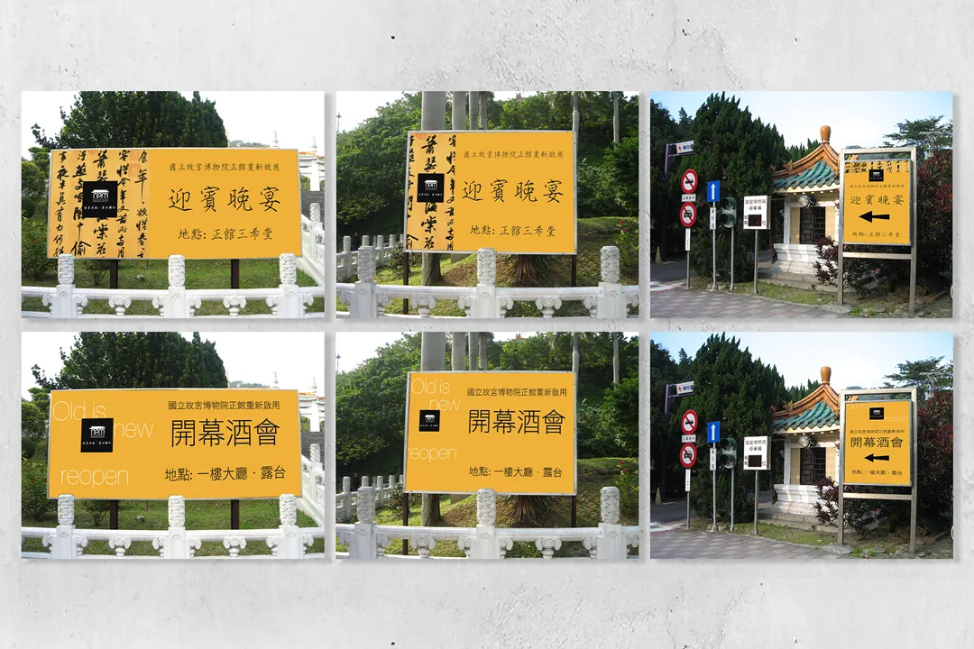
Extended visual design includes various indoor and outdoor event indicators, stage backdrop visuals, tote bag design, commemorative items, and menu design for the "Old is New" reopening reception.
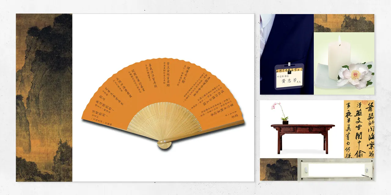
Expo Visual Design
2007 Taiwan-Japan Expo
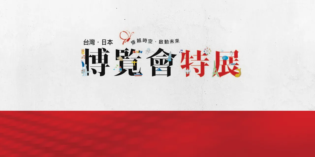
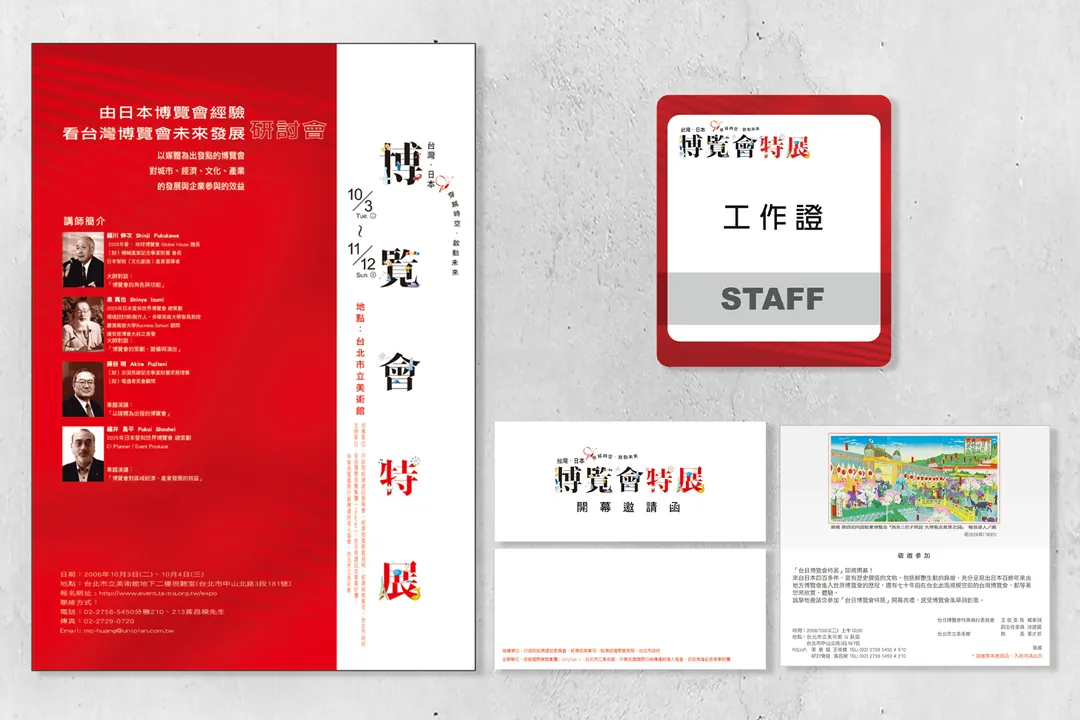
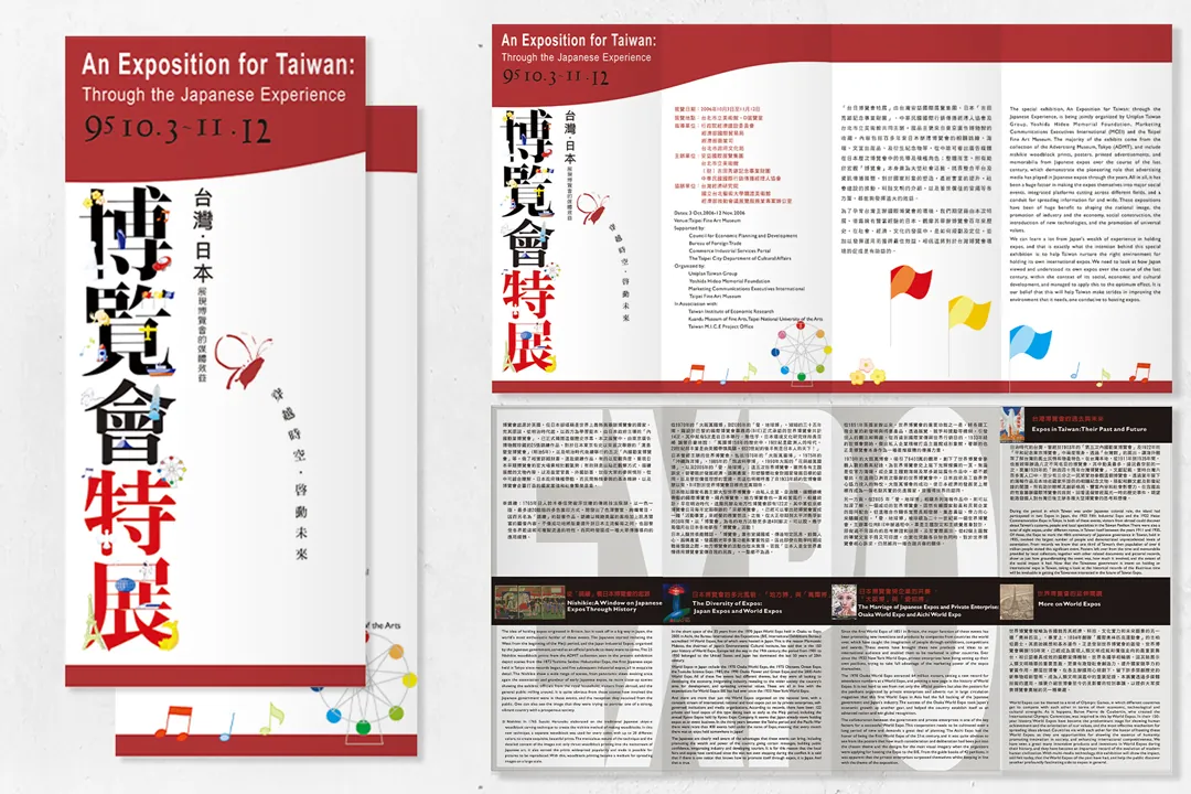
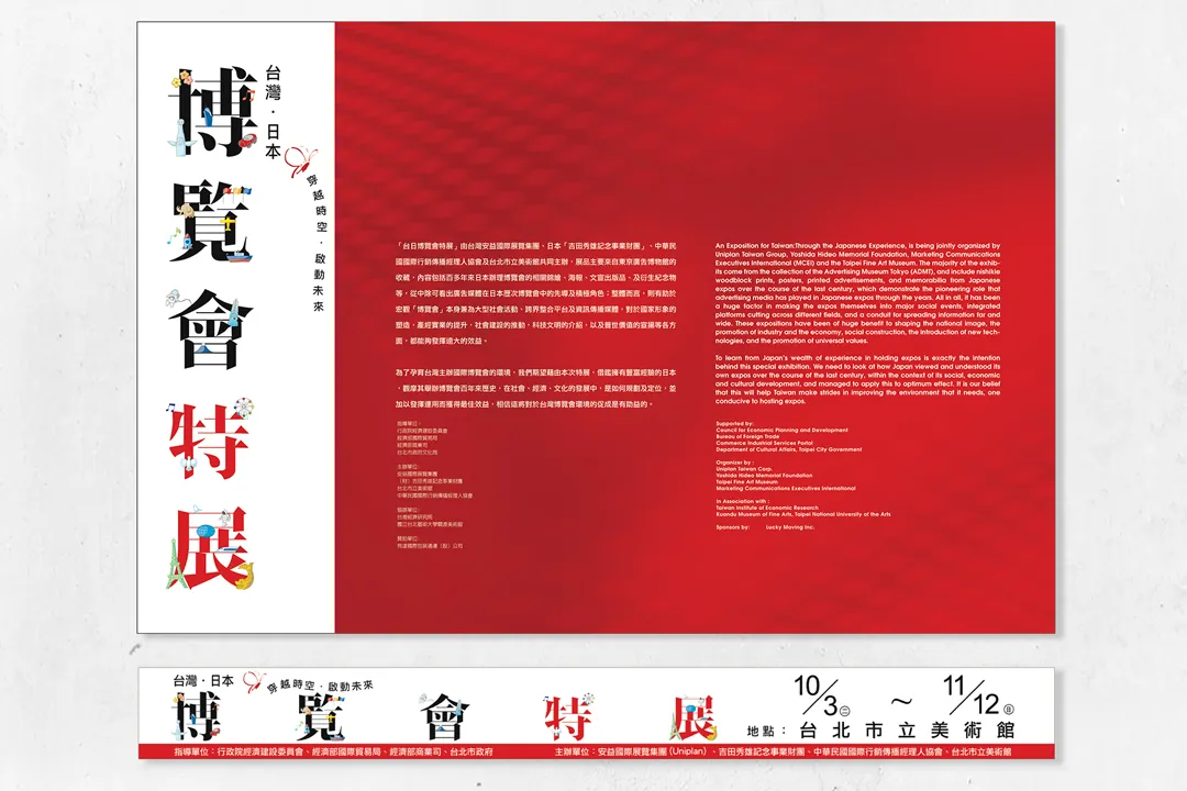
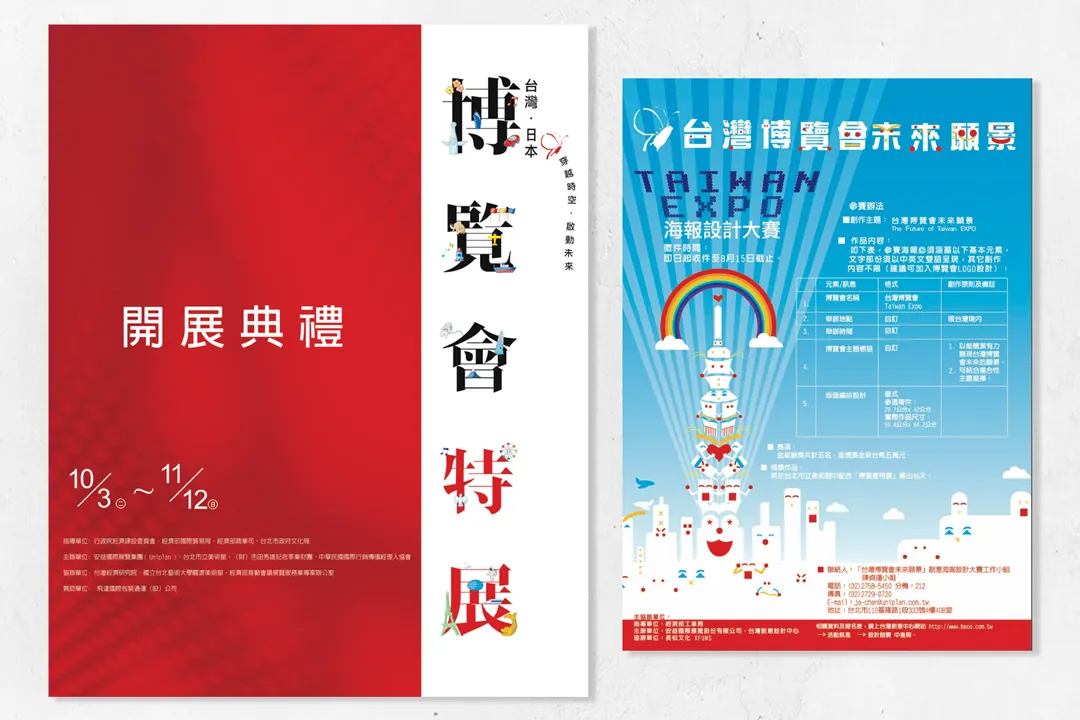
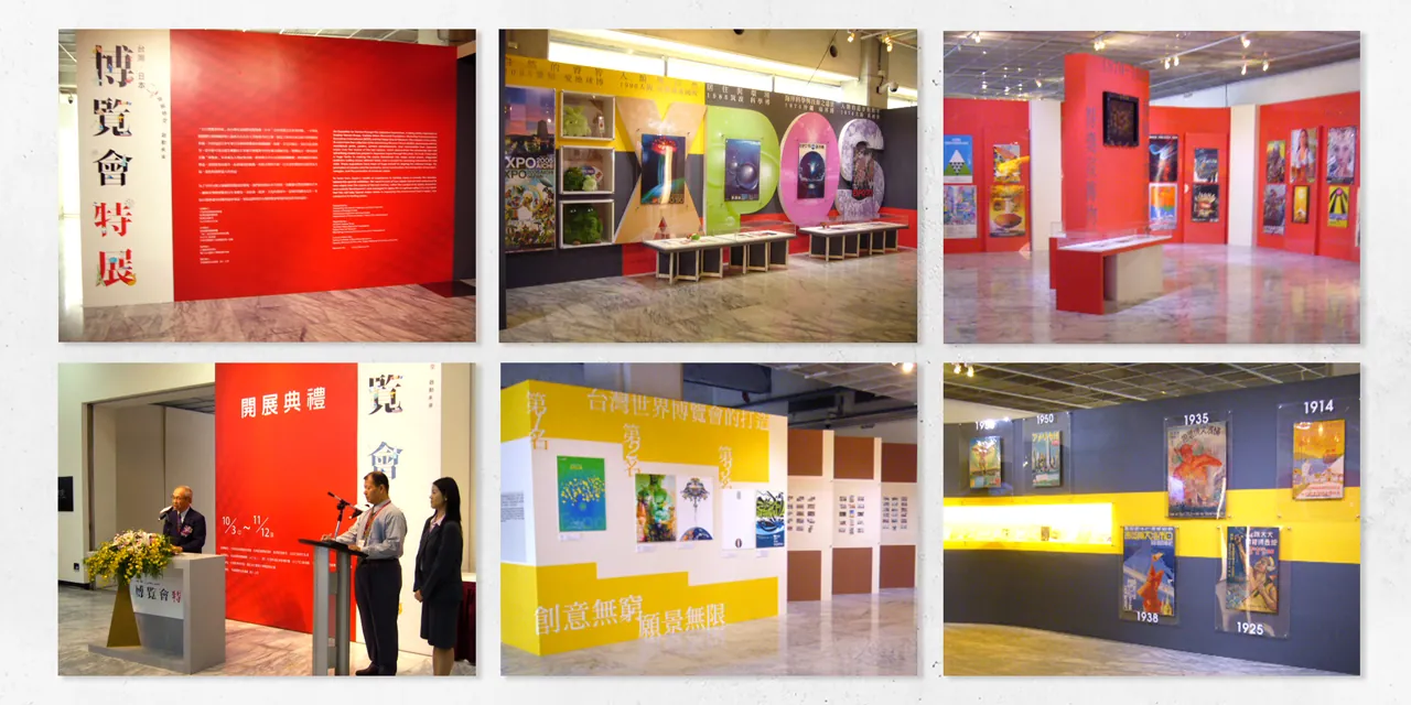
The exhibition's standard typeface design elements are derived from Taiwan's butterflies and Japan's flowers, integrating the primary color red into the visual applications.
CIS Redefinition
720armour

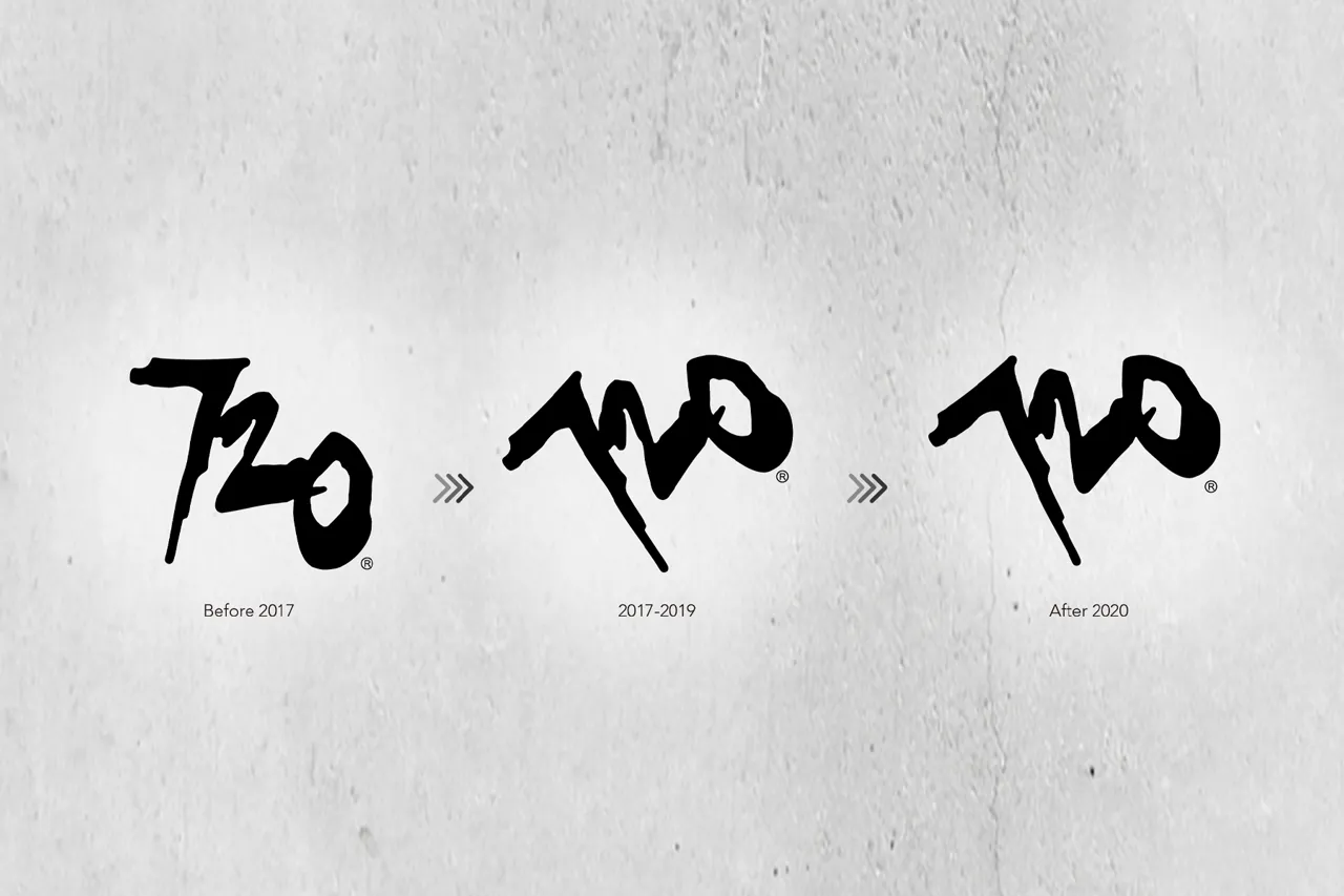
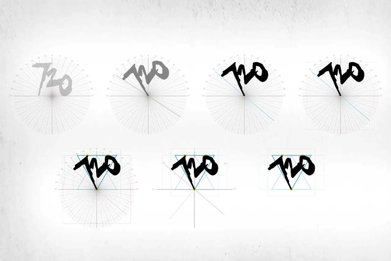
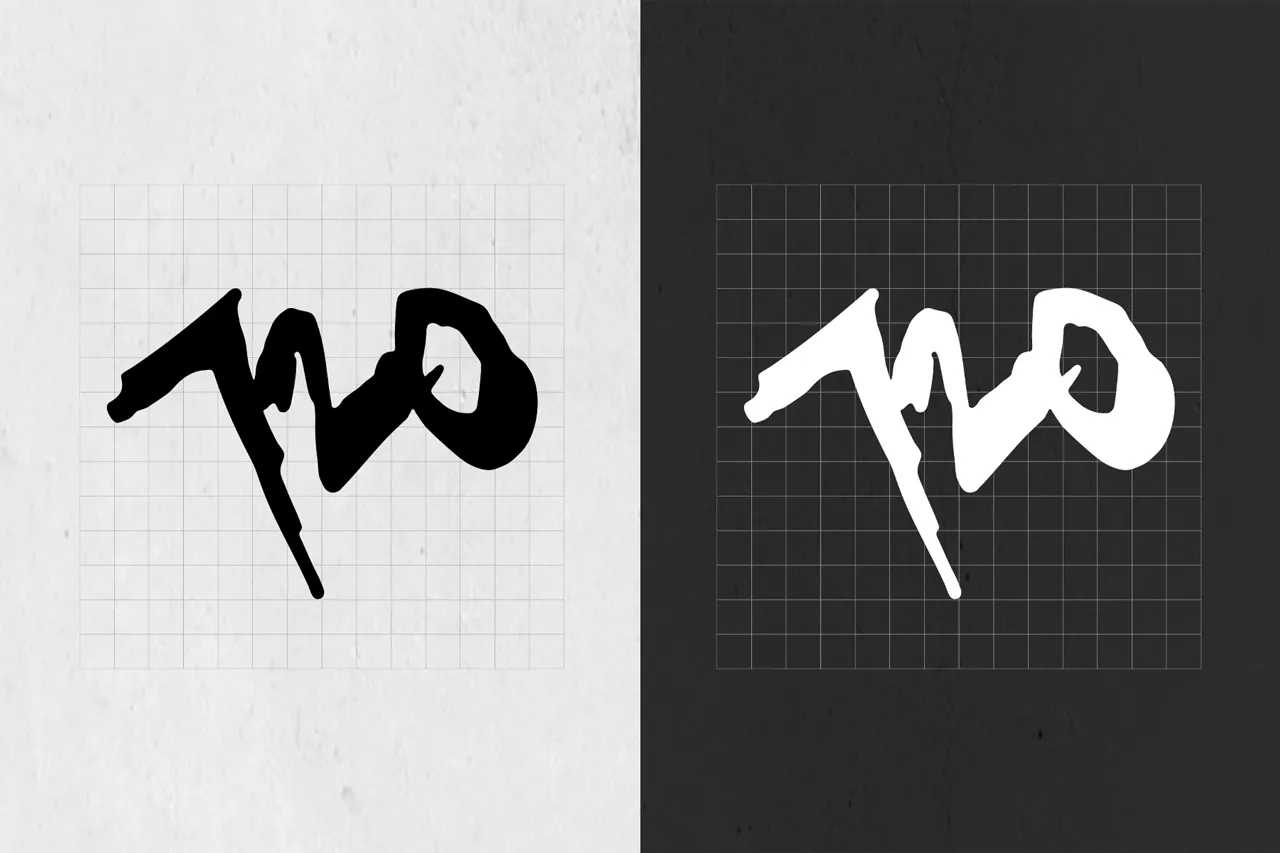
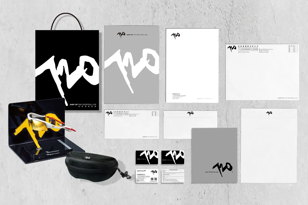
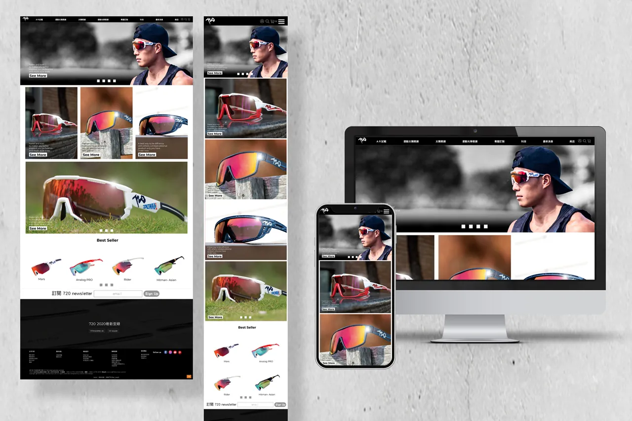
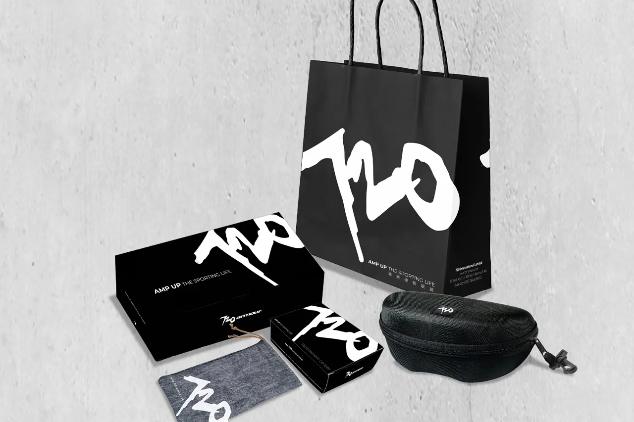
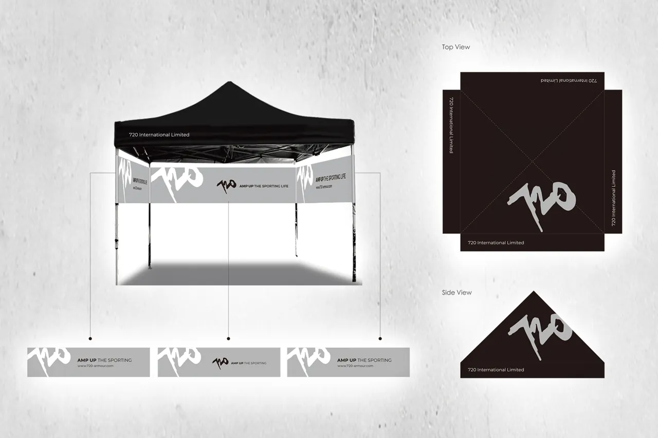
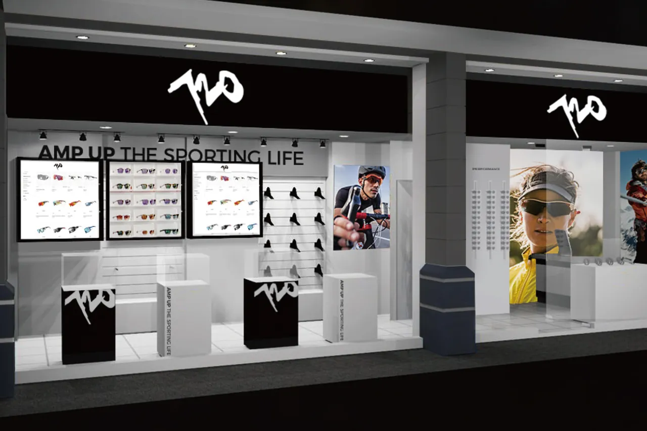
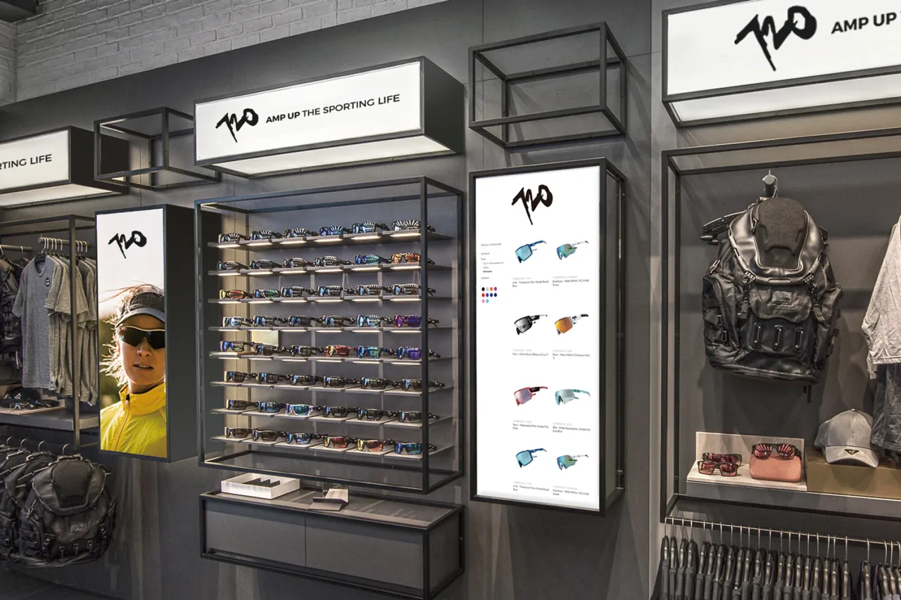
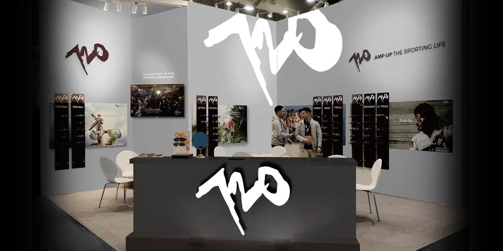
720 logo was strategically repositioned and the brand image redefined in 2019. I fine-tuned the 720 Logo’s angle for visual equilibrium, crafting a new dynamic brand impact.
Eyewear Graphic - HikeIt Series
SP Edition IP - 720armour
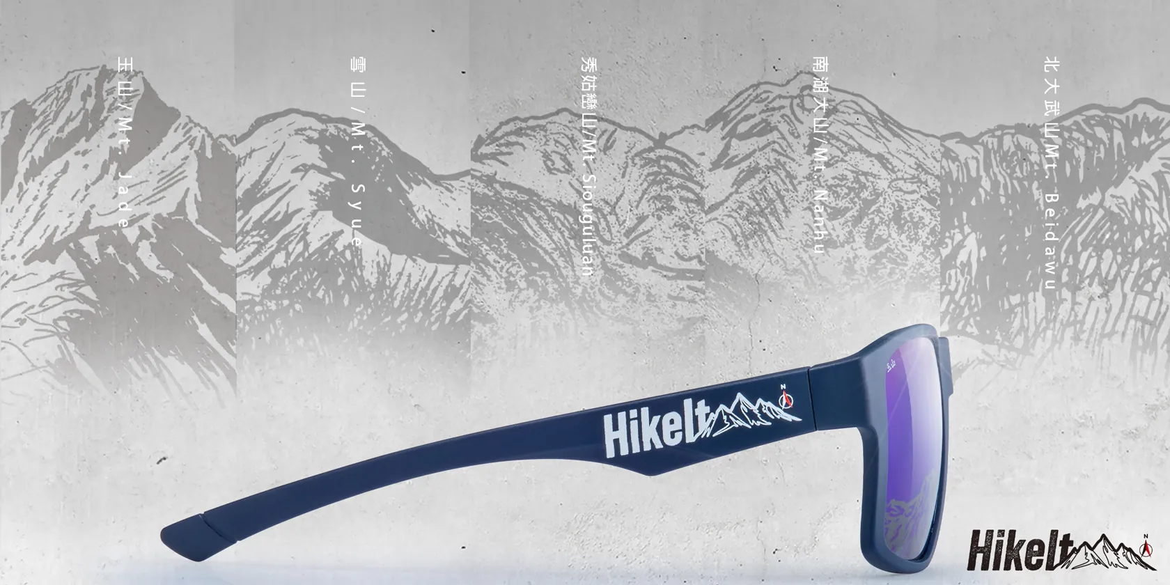
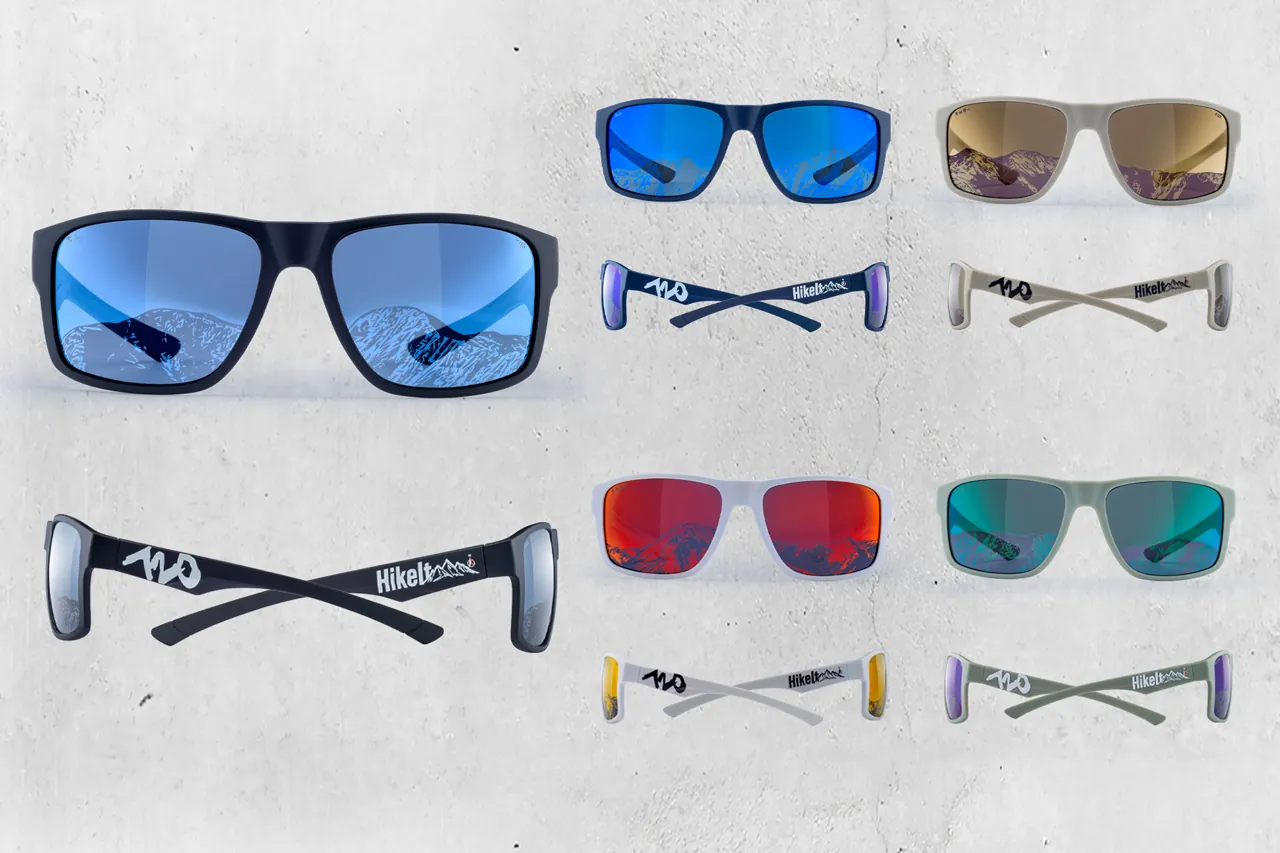
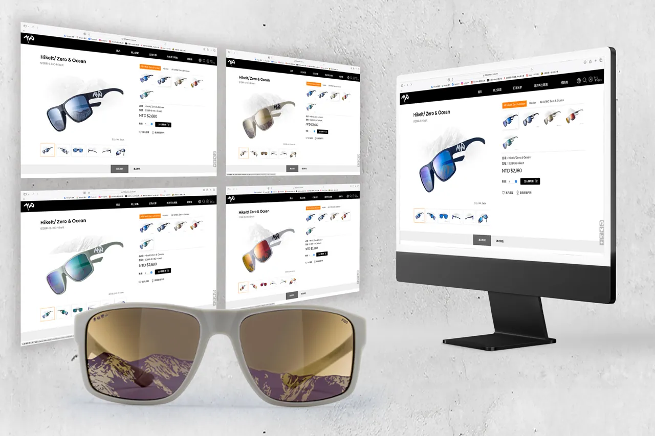
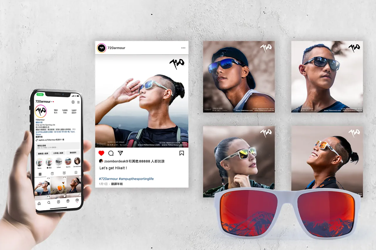
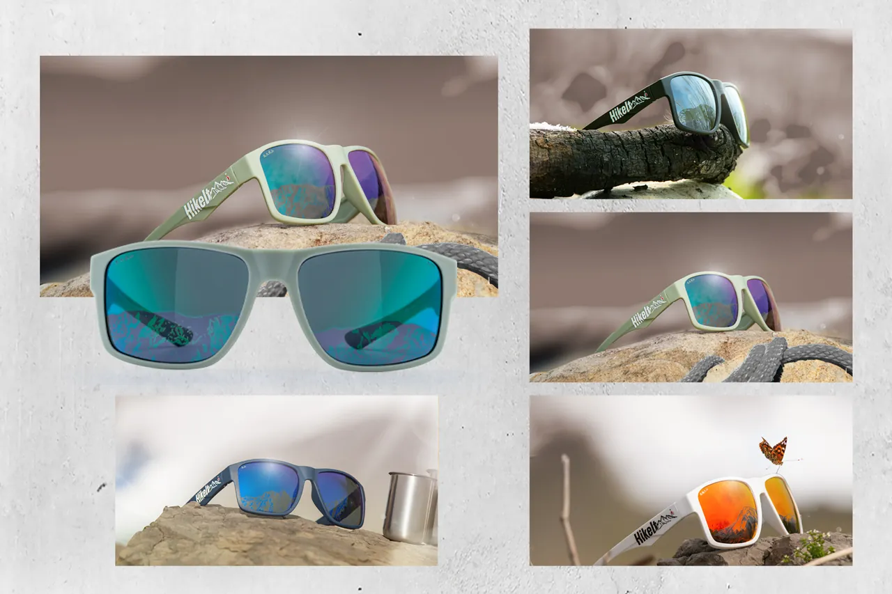
Hand-painted images print on lenses highlight the mountains without compromising vision. Over 70% recycled fishing nets compose the eco-friendly frames.
Bike Frame Paint Design
720 x Volando
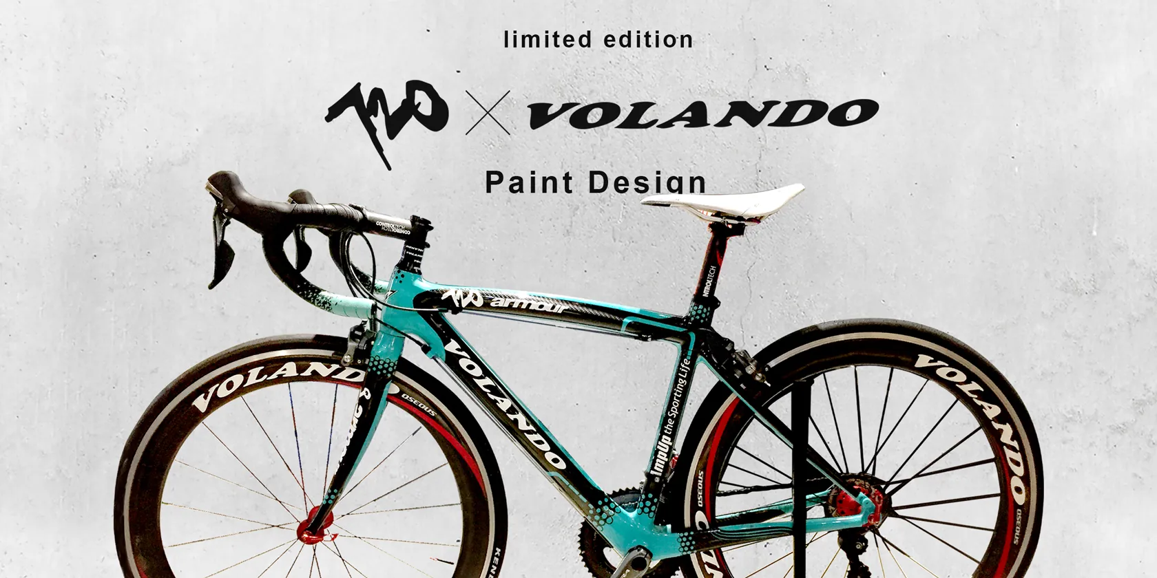
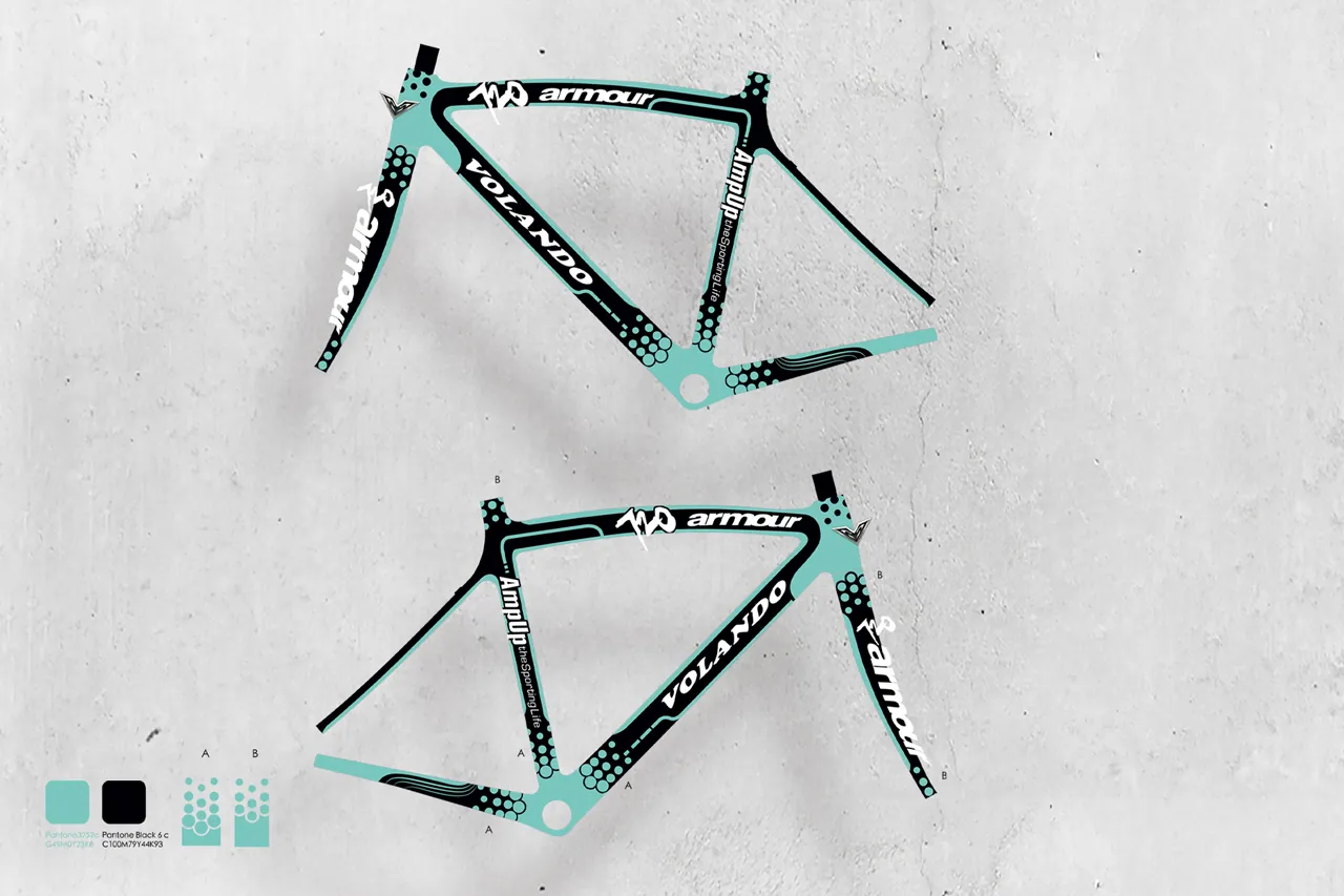
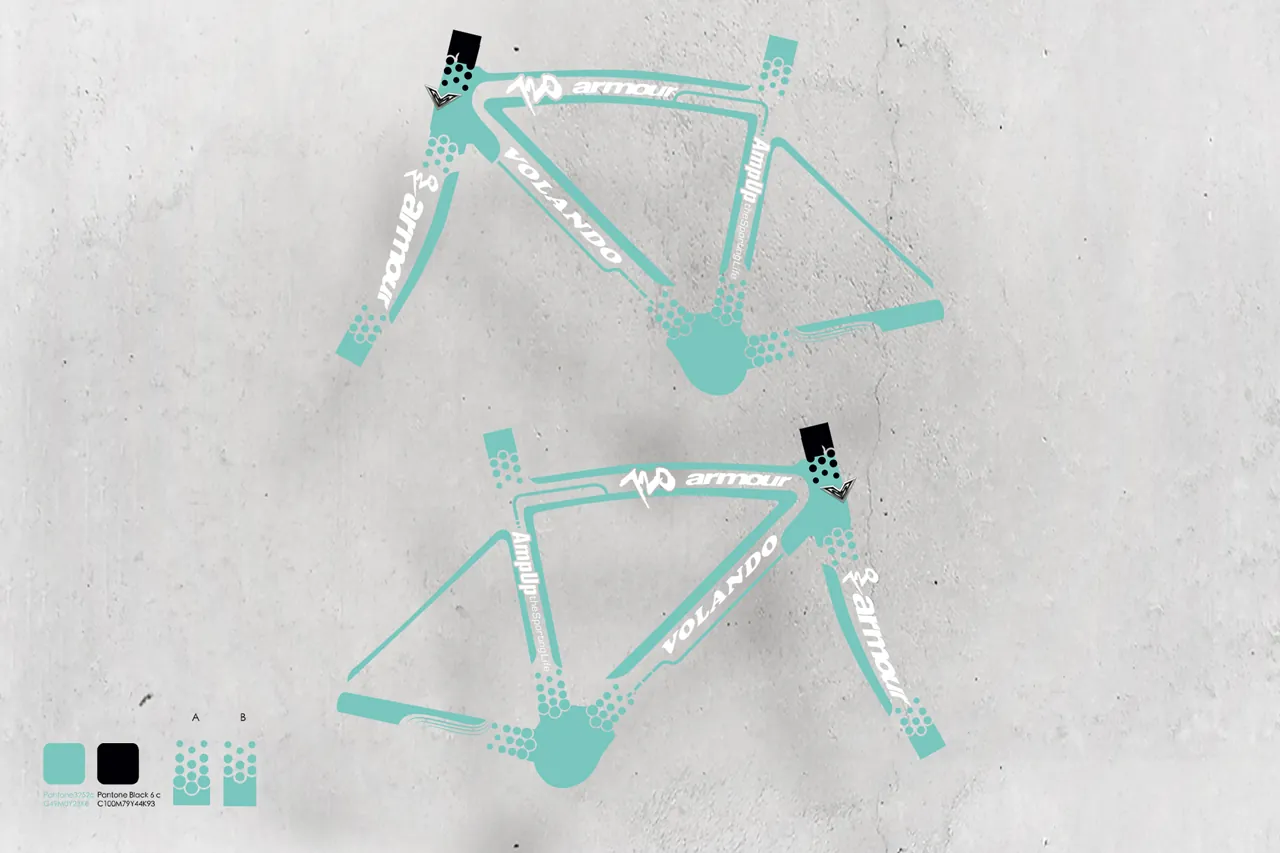
Road Bike Frame Paint Design, a limited edition brand product developed in collaboration between 720 and Volando.
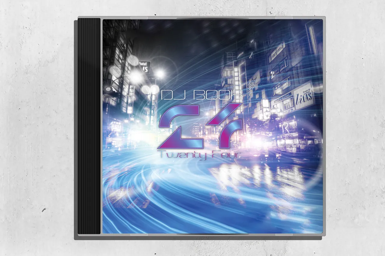
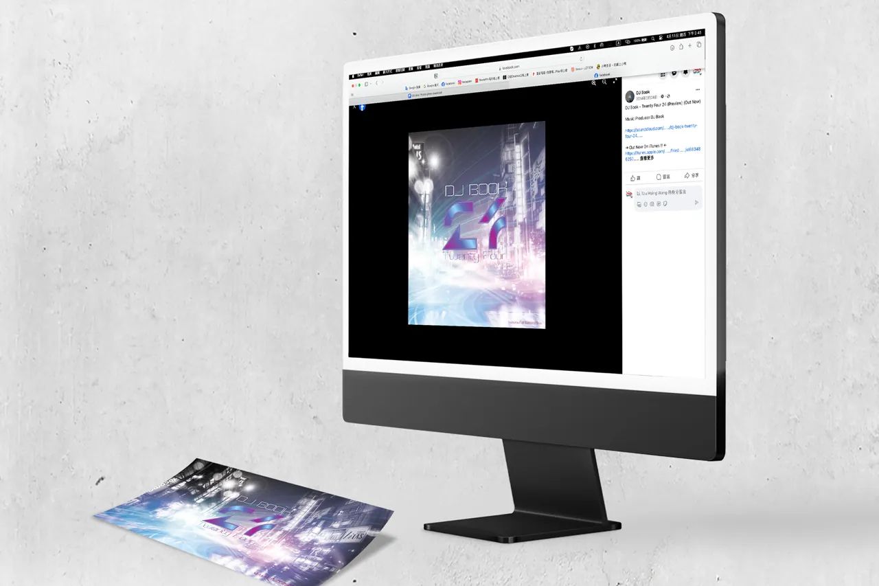
CD Cover & Poster
DJ Book / AIDS Prevention Contest

“Love me tender “ poster, awarded in the 2004 AIDS Prevention Contest, employs ink wash for fruits and flowers, echoing gender nuances.
Magazine Editorial
Taiwan Life Insurance Company
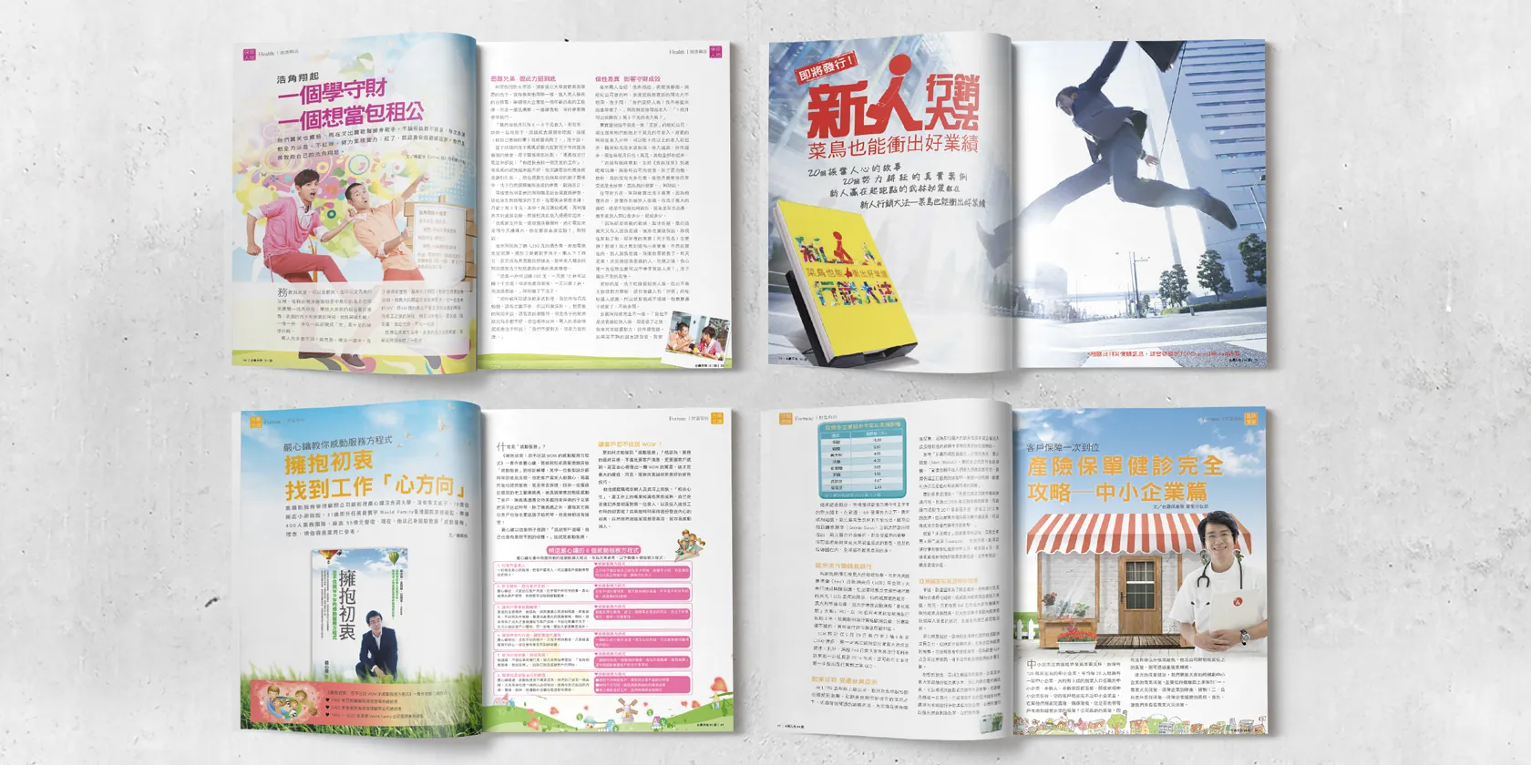
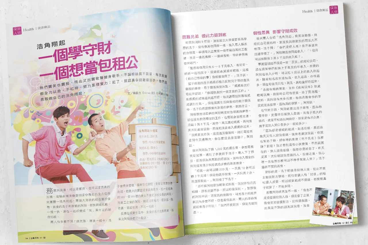
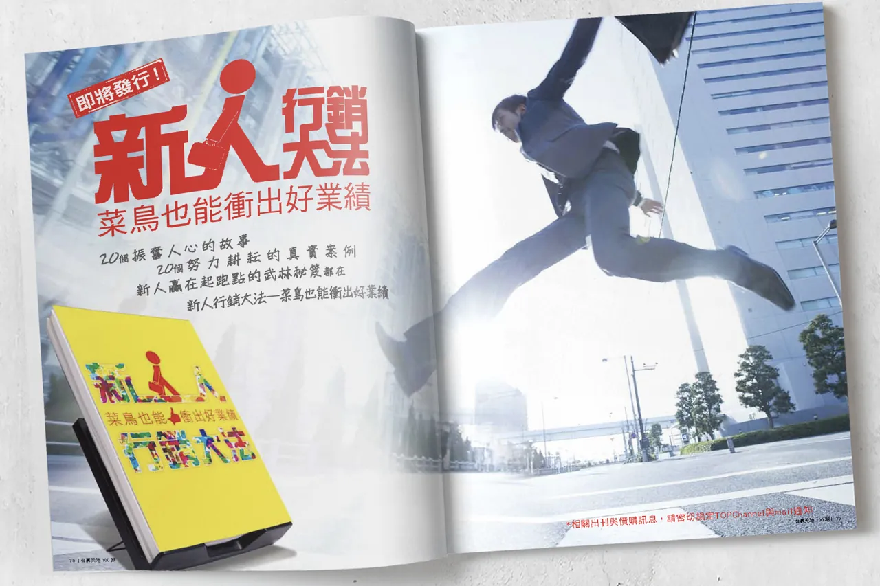
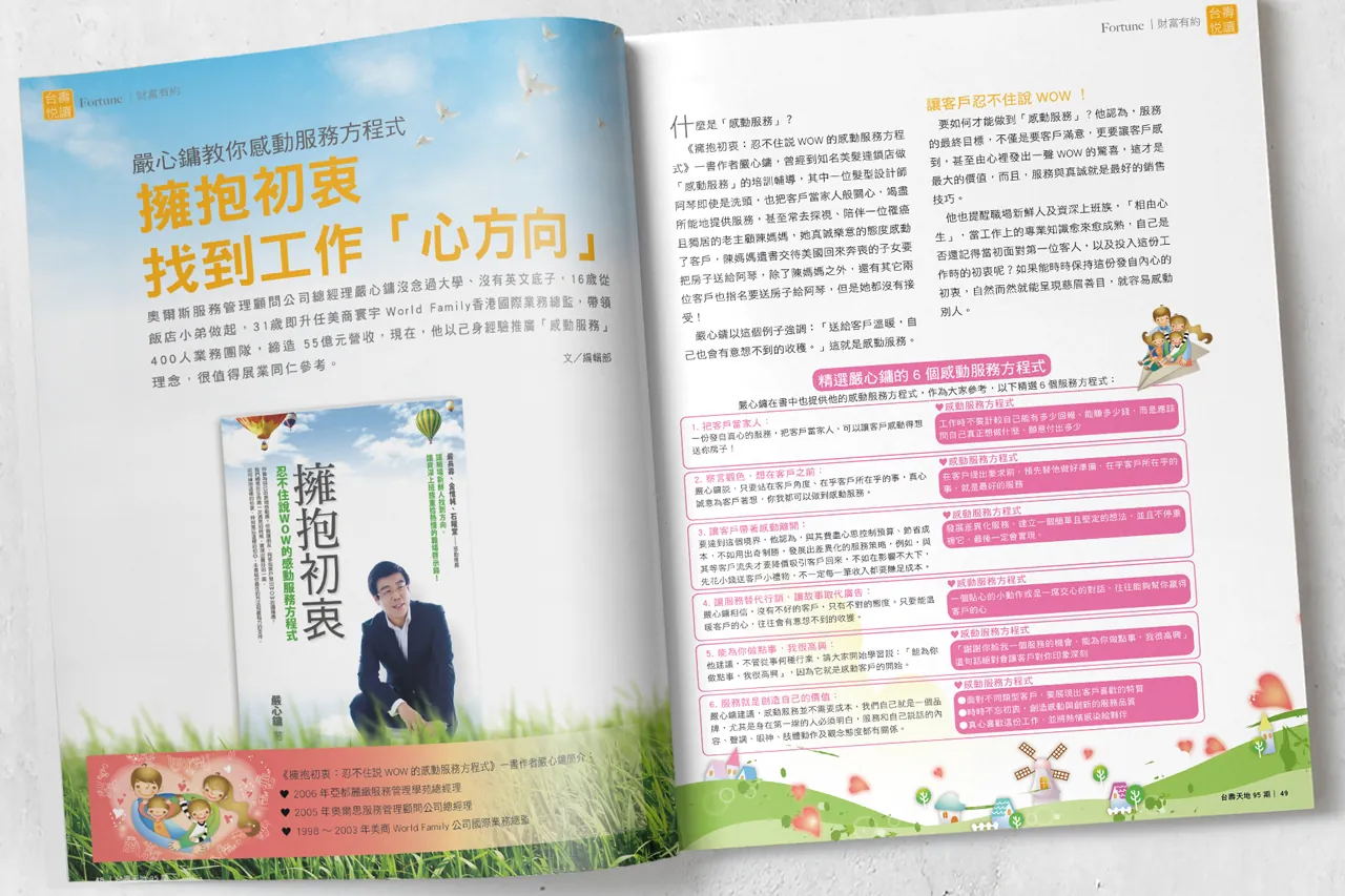
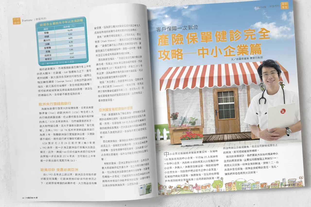
Enhanced each report with color and layout to make it easy to read and lively. The presentation of tables and figures can now more vividly connect to the narrative.
Brochure Design
Taiwan Life Insurance Company

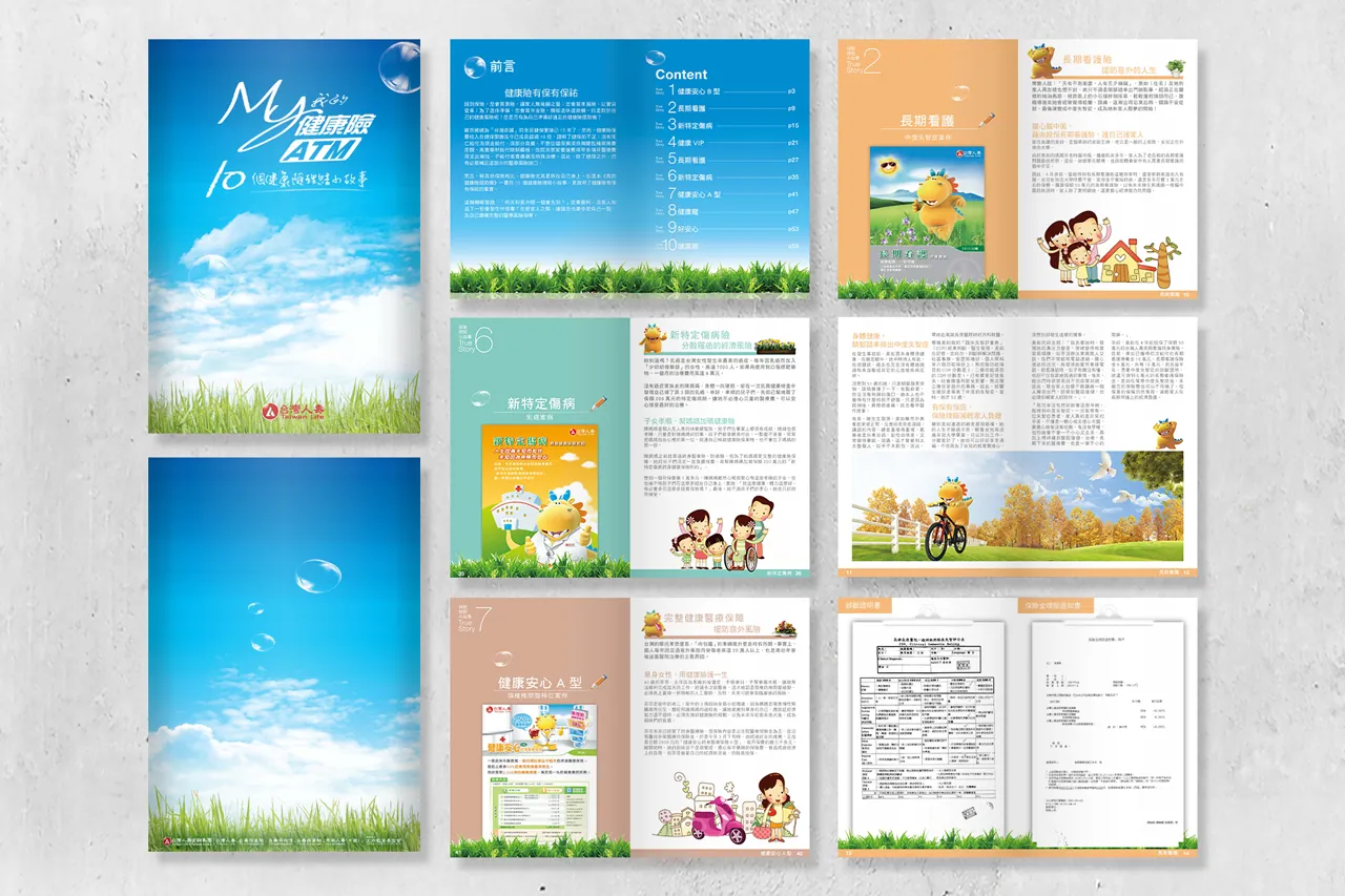
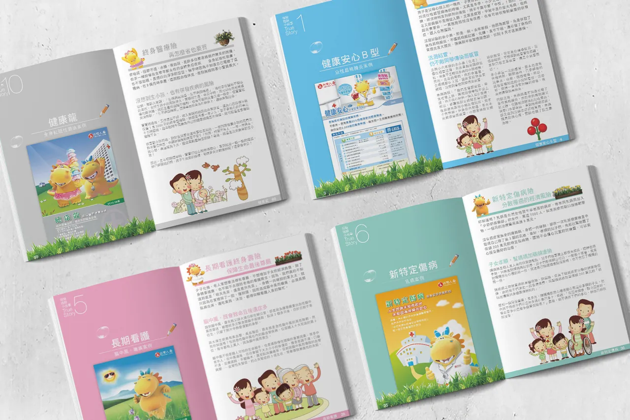
A clean, concise, and powerful layout, paired with common illustrations within the text, can assist consumers in generating associations and resonance.
720Run with Me Game
720armour
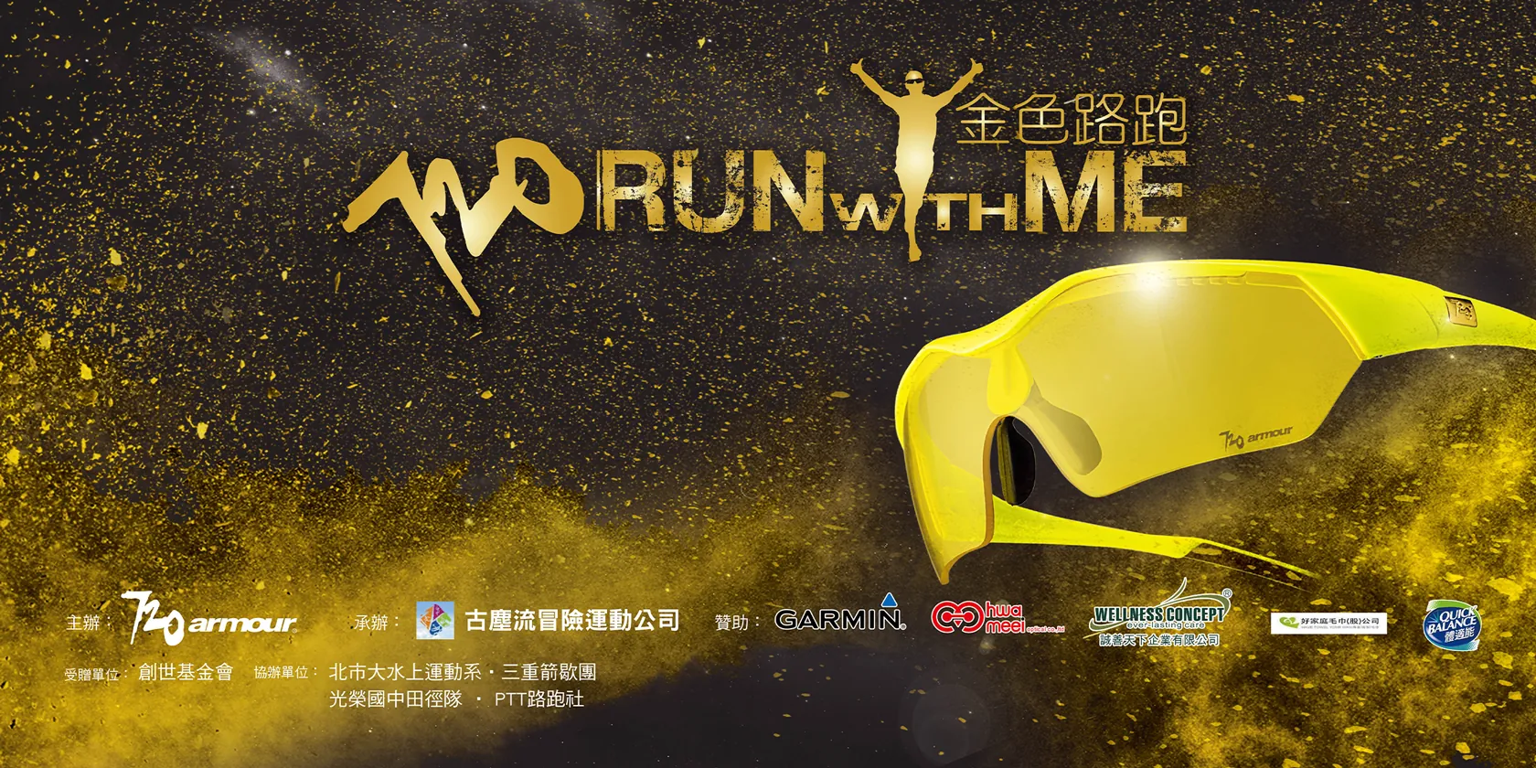
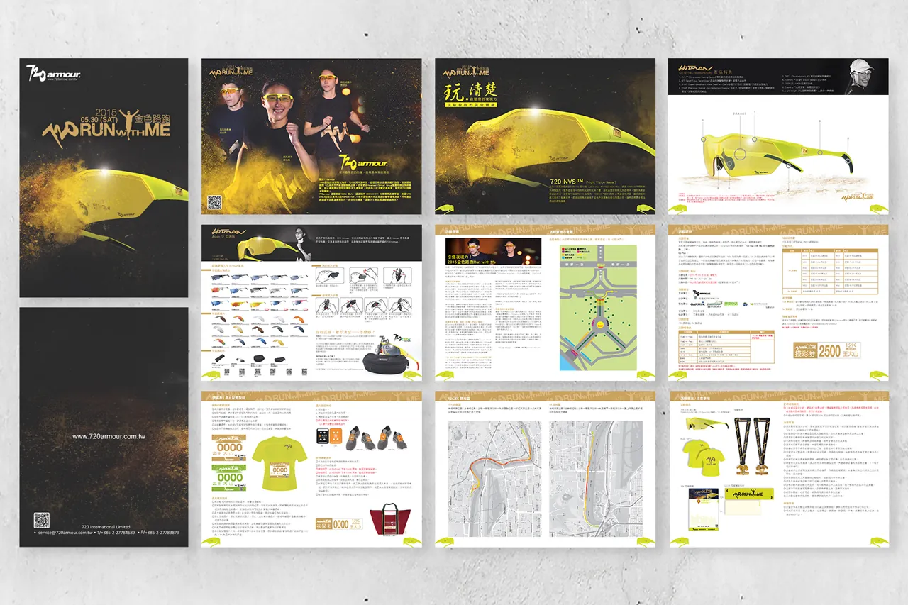
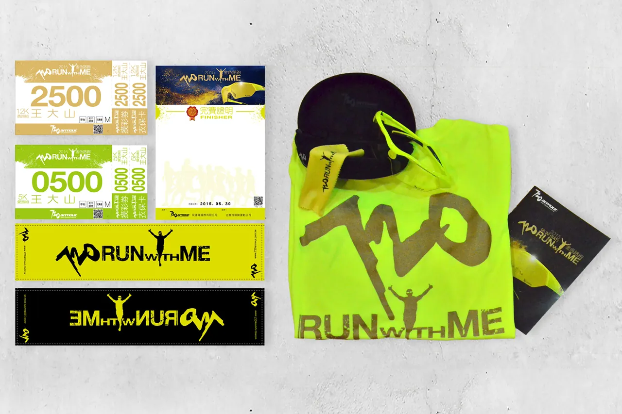
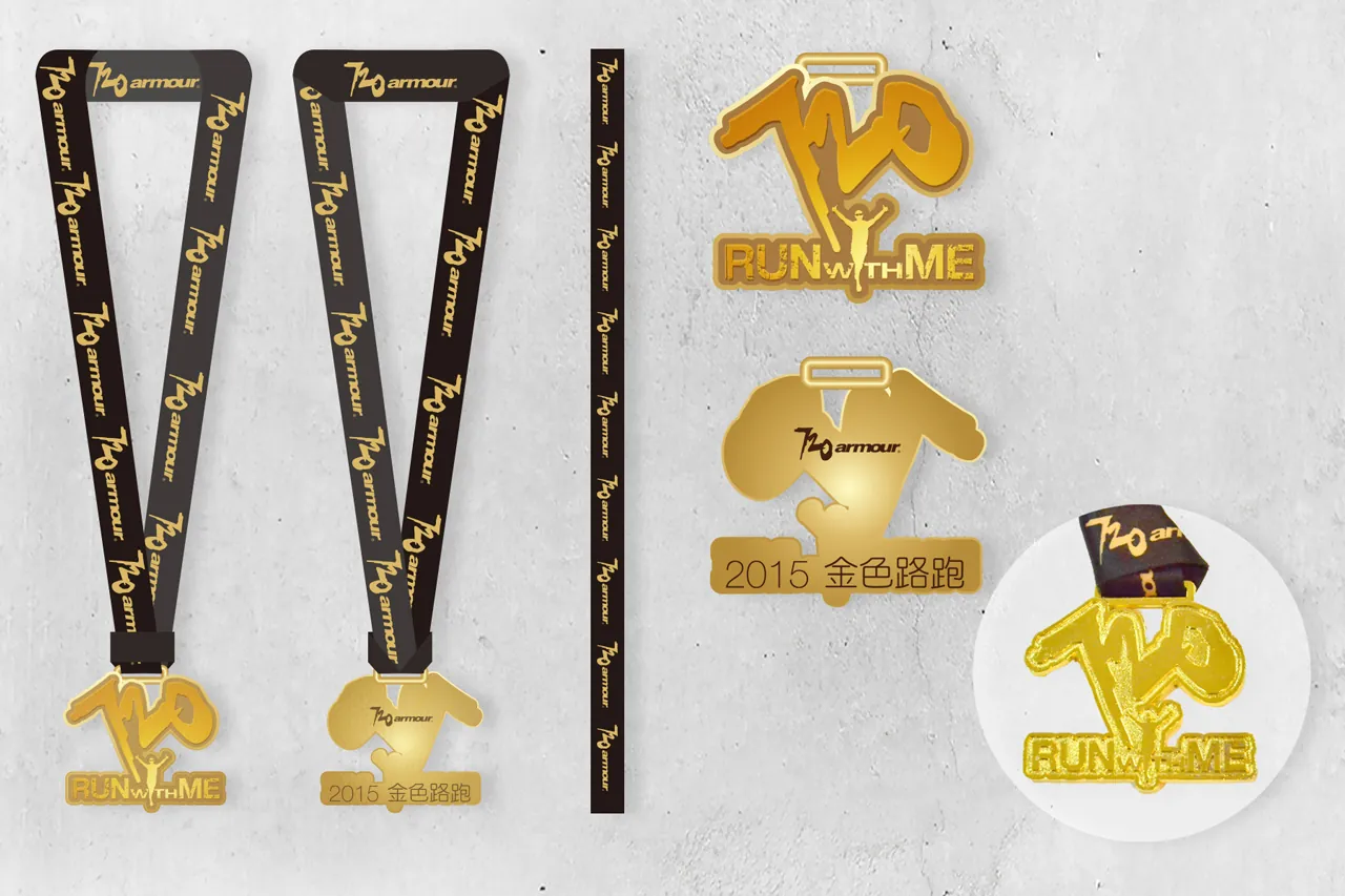
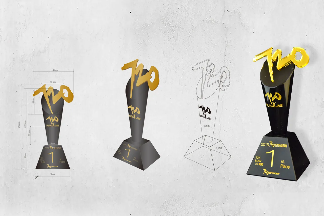
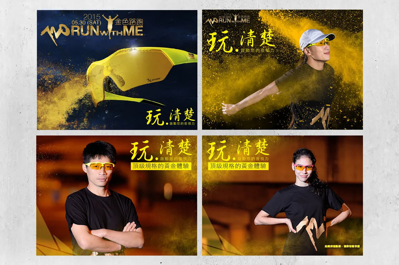
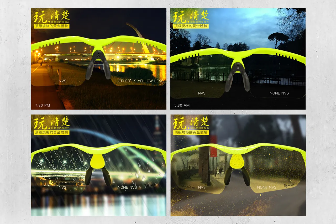
A comprehensive project encompassing the integration of the event activities, registration details, main visual design, photography, race manual, event signage, and finisher medals.
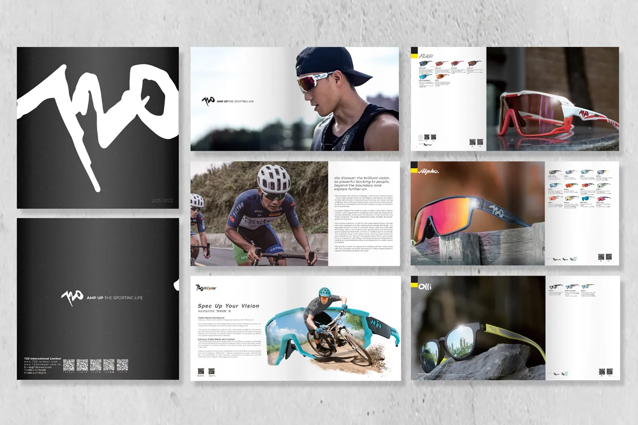
Magazine Ads
720armour
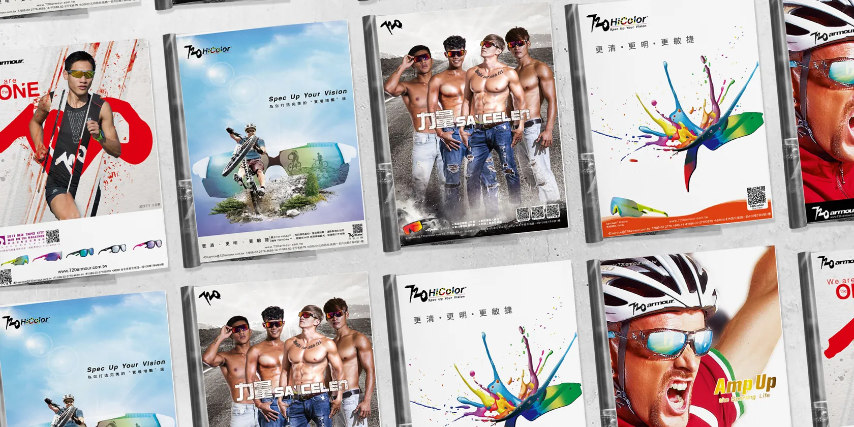
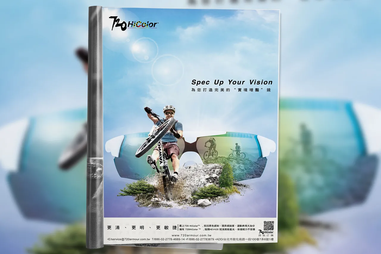

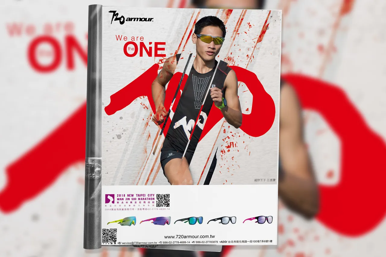
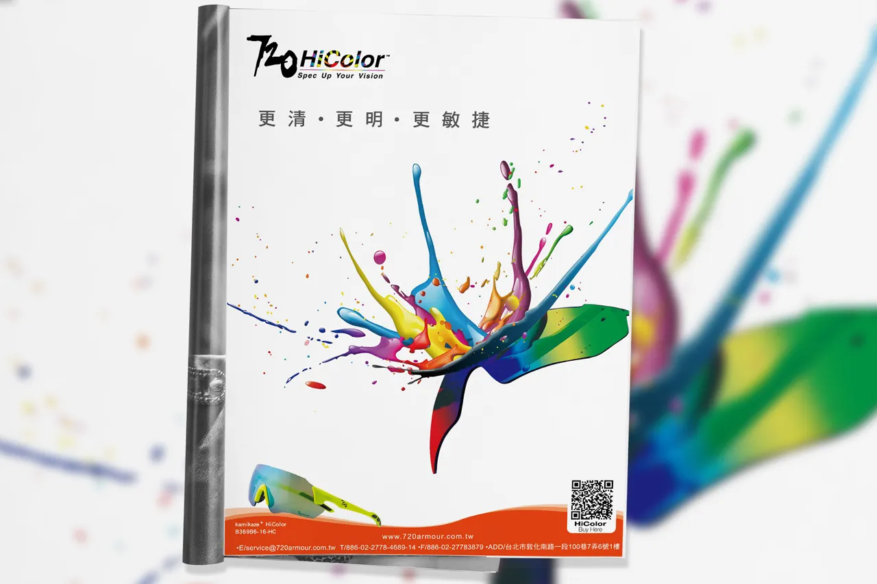
Presenting an exclusive collection of brand marketing campaigns developed for 720armour sports eyewear over a decade. The ads accentuate the cutting-edge 720HiColor high-contrast lens technology.